(Archive) Advertising District / Dump-Place
-
 19-April 07
-
 JDP
Offline
JDP
Offline
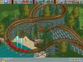
ahha good man... but i just noticed the eleven cars on the train... are you shooting for something like Apocalypse?Ill swap the seat and restraint colours jdp
-JDP -
 musicman
Offline
@RRP: I think the one crossover with the two diagonal tracks would look better if you shifted the lower track over one way or the other so the top and bottom line up and you don't get the huge gap in the supports. Also, it looks like the ride brakes in the transfer shed, which isn't very realistic in my opinion. I could be looking at it wrong though.
musicman
Offline
@RRP: I think the one crossover with the two diagonal tracks would look better if you shifted the lower track over one way or the other so the top and bottom line up and you don't get the huge gap in the supports. Also, it looks like the ride brakes in the transfer shed, which isn't very realistic in my opinion. I could be looking at it wrong though. -
 RRP
Offline
RRP
Offline
some inspiration from that yeaahha good man... but i just noticed the eleven cars on the train... are you shooting for something like Apocalypse?
-JDP
I see what you mean,im gonna be custom supporting it anayway so ill fill in that gap.No transfer shed on this ride.2 trains only@RRP: I think the one crossover with the two diagonal tracks would look better if you shifted the lower track over one way or the other so the top and bottom line up and you don't get the huge gap in the supports. Also, it looks like the ride brakes in the transfer shed, which isn't very realistic in my opinion. I could be looking at it wrong though.
-
 Maverix
Offline
Maverix
Offline
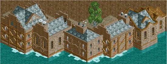
A bit unfinished up top. Going to be a small mid-evilish themed village looking for comments on the archy. -
 Austin55
Offline
I think more colours, perhaps add a flag or banner, or other small details to brighten it up, and maybe some more whites, blacks, and grays in the buildings themselves.
Austin55
Offline
I think more colours, perhaps add a flag or banner, or other small details to brighten it up, and maybe some more whites, blacks, and grays in the buildings themselves.
RRP-Thats looking amazing dude. Trackwork is stunning. -
 Chocotopian
Offline
I agree with the 'small details' to give each building a bit of individuality. However, the theme you’re going for is exactly what I thought when I saw it, so the archy is all good in my eyes.
Chocotopian
Offline
I agree with the 'small details' to give each building a bit of individuality. However, the theme you’re going for is exactly what I thought when I saw it, so the archy is all good in my eyes. -
 Cocoa
Offline
^right. I think the best example of this to help you out, although the theme is slightly different, is canthose valley by 5dave, specifically the backs of the building in the french area. get some grey in there too, and especially different textures.
Cocoa
Offline
^right. I think the best example of this to help you out, although the theme is slightly different, is canthose valley by 5dave, specifically the backs of the building in the french area. get some grey in there too, and especially different textures. -
musicman
Offline
The combination of cross-timbering and brick on the same surface doesn't look good to me. Maybe if you did a few brick buildings and a few timber-framed ones it would look better, but not both on the same surface, in my opinion.
-
musicman
Offline
I obviously have way too much time on my hands.

Should I keep the fountains?Attached Thumbnails
-
-
musicman
Offline
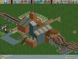
Okay, I'll get rid of them. What do you think of this station building? I'd like to add some windows using the horror wall/gate, but I can't get codex to work (using vista, tried switching to classic view but it didn't help). Would anyone be willing to help me with this?
Attached Thumbnails
-
-
musicman
Offline
What is this Robbie? Can't you let me have 30 seconds of relevance?
Just kidding. Looks awesome, can't wait to see more! -
wildroller
Offline
I was gonna post a screen, but I think I'll wait now! That looks pretty nice there robbie
 , better than the layout I was gonna post.
However the mismatch in texture on the awning seems strange, I know there's a curve awning piece, at least for the bottom part! -
 Cena
Offline
I should post my Disney Castle screen now to out-do Robbie ... But I think I will give him his moment now
Cena
Offline
I should post my Disney Castle screen now to out-do Robbie ... But I think I will give him his moment now
Looks awesome buddy
-
 BelgianGuy
Offline
get out, you're too good that I can't stand it....
BelgianGuy
Offline
get out, you're too good that I can't stand it....
LOL, the only thing I can fault is that "a" schould be "à"


Tags
- No Tags