(Archive) Advertising District / Six Flags Carolina
-
 31-August 09
-
 Comet
Offline
Those fences are perfect
Comet
Offline
Those fences are perfect
Everything else is great too
I would love to see a larger screen eventually though -
 Liampie
Offline
Liampie
Offline
I would love to see a larger screen eventually though
On the one hand I agree, on the other hand I don't. If I'm correct this park is nearing completion and it wouldn't take too long until we see this on the frontpage. The less screens shown, the bigger the impact. Hit me please.
-
 CedarPoint6
Offline
Thanks for all the rest of those comments! I really appreciate them.
CedarPoint6
Offline
Thanks for all the rest of those comments! I really appreciate them.
Well here's probably the biggest update I've done so far since I've reached a pretty huge milestone. I'll let the screens talk through most of this, I suppose!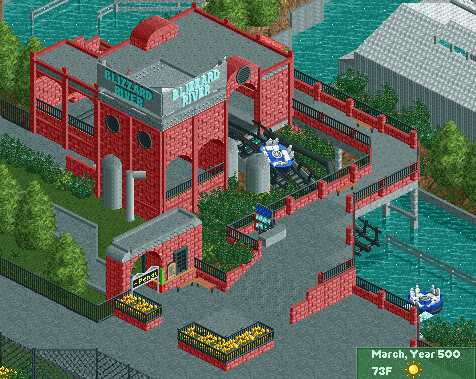
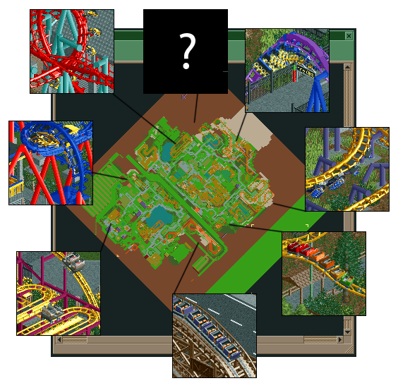
So as you can see, I'm quite a ways in. There's still a fair distance to go, but the park itself is actually coming together pretty well. All I'm doing right now is buildings and they're turning out surprisingly ok, so maybe we'll see some things get finished up in the next few months. Enjoy. -
 geewhzz
Offline
cool stuff, i still think the rapids ride isn't really that great. i don't know, even though it's based on one in real life with the red i just feel it doesn't work here, especially as a penguin theme..i would go for a darker theme, like the penguins lair from batman returns. but that's just me...
geewhzz
Offline
cool stuff, i still think the rapids ride isn't really that great. i don't know, even though it's based on one in real life with the red i just feel it doesn't work here, especially as a penguin theme..i would go for a darker theme, like the penguins lair from batman returns. but that's just me... -
 Goliath123
Offline
Needs more B&M's
Goliath123
Offline
Needs more B&M's
Pretty epic none the less although i agree with Gee, maybe try a dark purple?Edited by Goliath123, 12 November 2009 - 02:44 AM.
-
 Louis!
Offline
I don't think the screen is particularly impressive. The path bridge is the only thing in the screen I actually like. The rest is stale.
Louis!
Offline
I don't think the screen is particularly impressive. The path bridge is the only thing in the screen I actually like. The rest is stale.
It's just a flat faced box. Nothing interesting to look at. Yeah sure it may be based on something in real life, but that doesn't stop it from being ugly. I'm actually quite disappointed, i've always been a fan of your work but recently I haven't.
I do like the second screen, nice way of showing off all the coasters and they all look great. -
Fr3ak
Offline
I love the small screen in which the B&M goes over the path, looks really great.
And I love those markers, which indicate how tall you need to be to ride the ride
(epic sentence) and I will steal those.A penguin theme? The screen doesn't show.
Look what the ride entrance says. -
 J K
Offline
The Rapids ride is one of my favourite rides in the park. I can see what gee means by bringing the darker side in which may help but the screen as a whole is amazing. Love the mysterious coaster!!!
J K
Offline
The Rapids ride is one of my favourite rides in the park. I can see what gee means by bringing the darker side in which may help but the screen as a whole is amazing. Love the mysterious coaster!!!
-
 Jaguar
Offline
Excessive Clones?
Jaguar
Offline
Excessive Clones?
Empty Land?
SBNO Rides?
Coaster Crowded Areas?
You should just call it Carolina.
Just kidding, It looks great, but I don't like the brick station's color for blizzard river. -
Comet
Offline
The quality is great but I think it's lacking in creativity
Right now 4 of the 7 coasters we've seen are just clones
Although realism is my preferred style I always wondered why people strive to be as accurate as possible to real life layouts when it is in fact impossible to be perfectly accurate. In my opinion that's gonna be the only thing holding this back from being as good as Watkins Woods
I think it would be really interesting to see you try to pull off a B&M Goliath going over much of the East side of the park though -
CedarPoint6
Offline
I'll address a few of the thoughts so far.
First, yes, it is Penguin's Blizzard River. Based on the rides of the same name at Kentucky Kingdom and Six Flags New England:
http://www.themepark...amp;linkid=4991
In regards to the darker theme, there's not terribly much more I'm wanting to do to it. I like the station as-is since I think it captures Kentucky Kingdom's well even though there's not a good picture of that in the links I sent. The real ones aren't particularly dark (or themed for that matter), they just sort of carry a theme. That's what I'm doing here.
Addressing the cloned rides, an excessive number is exactly what I wanted. Like I said, I wanted a smallish mid-range Six Flags park, unlike the flagship parks a lot of people tend to make. At this point, it's not really about the creativity of layout for me, but the ability to try and get them as accurate as possible within the limits of RCT. I'm sure my next park will have more custom layouts, but right now I'm more interested in being as accurate as I can to the type and style of park I'm imitating. The ? coaster will be custom, however.
Anyway, thanks for the thoughts-- interesting to read some of the criticisms... I'll see what I can do. My one fear in all of this is that a lot of my thought process will be lost. Unless you've been to SF Kentucky Kingdom, a lot of this park will probably appear kind of awkward. But oh well... hopefully you'll enjoy it, although in the end I'm just having fun building it. -
Xcoaster Offline
I think it's looking pretty good. I haven't been to SFKK, SFNE, or DL, but I picked up on the road dividing the park that SFKK has, and I think you have the right feel going with the park. So far the park is reminding me a lot of SFA, probably partly because it's my most recent Six Flags visit, but it's also a similar size with the same sort of coaster set (though I was quite impressed by SFA's small collection, as Batwing and Wild One both ran very well). The Blizzard River station reminds me of SFA's a little, except they have that other sort of rapids ride (in addition to a standard rapids ride in the nicely themed western area). Also, great job on the Break Dance, I don't recall having seen one before. -
RamSam12
Offline
Looking better every update. This is what I was trying for in my Six Flags park that I had going earlier this year. You seem to have captured the atmosphere perfectly and this is sure to be the solid Six Flags park this site needs.
BTW, I want whatever bench you're using.
Edited by RamSam12, 12 November 2009 - 03:45 PM.
-
 RCTNW
Offline
Great Stuff CP. I wish I had your attention to detail for this kind of stuff. Looking forward to seeing it finished.
RCTNW
Offline
Great Stuff CP. I wish I had your attention to detail for this kind of stuff. Looking forward to seeing it finished.
James -
 zburns999
Offline
zburns999
Offline
and this is sure to be the solid Six Flags park this site needs.
Uhmmm, Worlds of Excitement, one of the greatest parks ever made?
Oh, and CP6, the rest looks really nice. What you show of the Blizzard River looks great, however I'm really curious to see how you tackle a run of the mill rapids ride. I feel like the only really good rapids rides I've ever seen have been over-the-top in nature. The two that come to mind are Phatage's in BGS, and the one in El Encierro. Both great, but not ordinary by any means.
And the coasters all look good. Angle you show of bizarro looks like a lawsuit waiting to happen, though...with the decapitations and such lol.
Good work though. Can't wait to see this done.Edited by zburns999, 12 November 2009 - 07:53 PM.
-
 Steve
Offline
The park is looking solid as ever, Brian! I really like how the station for Blizzard River turned out. Keep it up!
Steve
Offline
The park is looking solid as ever, Brian! I really like how the station for Blizzard River turned out. Keep it up! -
 JDP
Offline
Yeah man, not feeling the Blizzard River station... its that red. Another thing, i think that que line should have an actual fence rather then the curbs. It just doesn't justify it imo.
JDP
Offline
Yeah man, not feeling the Blizzard River station... its that red. Another thing, i think that que line should have an actual fence rather then the curbs. It just doesn't justify it imo.
And having 3 yellow roller coasters at lease gives me a better reason to not think about the old Chang colors on Bizzaro. Keep it up man.
-JDP

Tags
- No Tags