Related Games / Indiana Funland:After the Storm
-
 06-January 10
-
 K0NG
Offline
^ No, that would fuck it all up. Scenery can become monotonous and would interfere with the wonderful view of all the various blades of grass.
K0NG
Offline
^ No, that would fuck it all up. Scenery can become monotonous and would interfere with the wonderful view of all the various blades of grass. -
 nin
Offline
i like how this topic has more replies than most good topics here. maybe a new screen or two?
nin
Offline
i like how this topic has more replies than most good topics here. maybe a new screen or two? -
 LDW
Offline
faroc, I think you should just scrap the whole "over the years" story and get down to advertising your park. Wait until you have done lots of work and then update. And seriously, reply to what we say back to you. It will helps you to improve the park and keeps the people at ne happy.
LDW
Offline
faroc, I think you should just scrap the whole "over the years" story and get down to advertising your park. Wait until you have done lots of work and then update. And seriously, reply to what we say back to you. It will helps you to improve the park and keeps the people at ne happy.
My comment: I think you have very little so far, maybe more scenery can help you. The coaster does stand out and trees will definatley help you out! Good luck
-
fraroc
Offline
1975
Hello Everybody, Its only two weeks befor opening day and we are exited as all hell about this! I decided to take a couple of last pictures before opening day
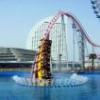
Twist and Shout completing a final test run.
I had the privledge to ride Indiana Flyer. Im satisfied with it. The hills provide some SERIOUS airtime.
See you opening day
Avery RossEdited by fraroc, 15 January 2010 - 05:00 PM.
-
nin
Offline
Ok, the first screen could easily be 1000x better if you just added stuff along the path: benches, fence, foliage..
-
Alpengeistfan1
Offline
The path still looks really bad, and what is that square of path doing in the first screen thats not connected to anything. Also, you still need to add some foliage and buildings.
-
fraroc
Offline
Hello all! We finished designing the Logo for our park!
How do you guys like it?Attached Files
-
 Park_Logo.JPG (12.71KB)
downloads: 23
-
-
 Goliath123
Offline
Its shit house, no offence but it is
Goliath123
Offline
Its shit house, no offence but it is
Also how can a turn on a coaster provides "SERIOUS Airtime!!" -
 RCTCA
Offline
That's a logo? ... All you did was go in Paint and make a blue background and red text over it. Looks like you made it in 5 minutes, just like your park! You need to slow down and take much more time on things. Otherwise, you won't get, at least, good comments to help you improve. We all have been giving you great advice... take some of it.
RCTCA
Offline
That's a logo? ... All you did was go in Paint and make a blue background and red text over it. Looks like you made it in 5 minutes, just like your park! You need to slow down and take much more time on things. Otherwise, you won't get, at least, good comments to help you improve. We all have been giving you great advice... take some of it. -
 Jaguar
Offline
This is like the bootleg version of Charleston Gardens Amusement Park. Honestly, no one wants to see bare flat rides and a couple of trees near a river and a 30 sec logo. Stop doing the park in different ages and just make more finished screens, even I am annoyed by this because the screens are just of the same thing with maybe just a flatride or a couple of trees added. Being from Indiana myself, that is not what it looks like. There should be more hills and trees and some foresty terrain. Maybe make some ravines with dirt terrain and put trees in them. Also add some bogs and wetlands.
Jaguar
Offline
This is like the bootleg version of Charleston Gardens Amusement Park. Honestly, no one wants to see bare flat rides and a couple of trees near a river and a 30 sec logo. Stop doing the park in different ages and just make more finished screens, even I am annoyed by this because the screens are just of the same thing with maybe just a flatride or a couple of trees added. Being from Indiana myself, that is not what it looks like. There should be more hills and trees and some foresty terrain. Maybe make some ravines with dirt terrain and put trees in them. Also add some bogs and wetlands. -
fraroc
Offline
Also, Im not terribly impressed with the logo either. I am thinking of adding a little pizazz to it. Paint makes everything look so plain.
-
 Austin55
Offline
Wow! You're improving fast. Looks really good. Just keep listining to everyone's advice and you'll continue to imrove. Keep up the good work!!
Austin55
Offline
Wow! You're improving fast. Looks really good. Just keep listining to everyone's advice and you'll continue to imrove. Keep up the good work!! -
fraroc
Offline
I tried to fix it a little.
I find that the blue box I was using was too big and that would make the text look ugly.
I shortened the box to make the text fit in and be more prominent I feel now it actually looks like a park logo.Attached Files
-
Park_Logo.JPG (10.71KB)
downloads: 21
-
-
Austin55
Offline
MS paint did not exist in 1975.
Oh BTW, Mr. Ross, you need to fire whoever it is your paying to make your logos. I have a few mirrors if your interested -

FullMetal Offline
*coughKevinEnnscough*This isnt someone elses second account is it?
Now, I'm going to be completely honest with you, fraroc: You have the right idea. You've got a few flats and one coaster. (How a fledgling amusement park could afford a wooden coaster in 1974 is beyond me. Unless your parent company is Six Flags and your going to blow all your money and go bankrupt in the first five seasons, but I digress.) What you need is more trees, more flowers, more fences, a few more buildings (anyone see a bathroom?), and a few more realistic touches (if that's what your trying to shoot for). I can tell you don't live in Indiana, because the landscape looks nothing like it. The landscape is flat and barren. You need some natural elements like a pond/lake, trees, or if you really want to go over the top, farmland that you plan to purchase and work with later on. The point being: If you're going to name a park after a state, make it look as though the park exists in said state.
Secondly, add some detail to the cafe. Windows would be a great help. And get rid of the crappy stalls. I think Soaked! introduced customizable stalls (the ones with just a counter and no stupid giant burger around them), but I'm sure you could find some on the Net. Use those instead.
Hopefully you'll start taking everyone's advice and this park will become as popular as CGAP. Just because your time line starts in 1974 doesn't mean that the park has to be crap.


Tags
- No Tags