(Archive) Advertising District / Starpointe
-
 16-February 10
-
 T.N.T.
Offline
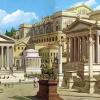
Those soda machines stick out like a sore thumb (the ones center; I didn't notice the other one until I looked closer). But the rest of the screen is great. You didn't overload on the various foliage and you broke up the grey quite nicely.
T.N.T.
Offline
Those soda machines stick out like a sore thumb (the ones center; I didn't notice the other one until I looked closer). But the rest of the screen is great. You didn't overload on the various foliage and you broke up the grey quite nicely. -
 JJayMForce
Offline
Love your style Pacificoaster, and nice job on the screen. The crown moulding as fountains looks great too, nice thinking.
JJayMForce
Offline
Love your style Pacificoaster, and nice job on the screen. The crown moulding as fountains looks great too, nice thinking. -
 Cocoa
Offline
in my experience, drop rides like that need massive lines. but otherwise, a great screen. I really dislike those soda machines though, use the different stall ones or just make your own maybe?
Cocoa
Offline
in my experience, drop rides like that need massive lines. but otherwise, a great screen. I really dislike those soda machines though, use the different stall ones or just make your own maybe? -
 Louis!
Offline
It's little bits like this that, to me, look like robbie's work in SFSF.
Louis!
Offline
It's little bits like this that, to me, look like robbie's work in SFSF.
Not that that's a bad thing. -
 Arjan v l
Offline
You've heard it several times now ,but those soda machines screw up the screen.
Arjan v l
Offline
You've heard it several times now ,but those soda machines screw up the screen.
Other than that ,it's lovely.
And i hope it's YOUR style (hint).
-
 pierrot
Offline
it seems that you need to create a bad-ass custom vending machines on there, I know you can do this easily.
pierrot
Offline
it seems that you need to create a bad-ass custom vending machines on there, I know you can do this easily. -
 Steve
Offline
I agree with everyone about the soda machines and how awesome everything still looks. Maybe try hiding the soda machines a little like you seemed to have done in the very top right?
Steve
Offline
I agree with everyone about the soda machines and how awesome everything still looks. Maybe try hiding the soda machines a little like you seemed to have done in the very top right? -
 robbie92
Offline
robbie92
Offline
It feels like a good mix of Robbie, CP6 and Nin.
A terrible combo. Strive to emulate good parkmakers, Justin!
-
imawesome1124
Offline
I think it's perfect except three things:
1. Obviously the bending machines.
2. The queue roofs for Dominator need some more trim.
3. *Uber Nitpickiness!* The water fountains on the side of the building are a clever idea, but whenever I see them they are at different levels, one for kids and one for adults. Again this is like the king of nitpicks, and I wouldn't mind at all if you kept it the way it is, it's just an observation. -
 Dr_Dude
Offline
Dr_Dude
Offline
1. Obviously the bending machines.
as everyone has said, the water fountains are so damn elegant there's no way you couldn't make a better vending machine yourself -
RamSam12
Offline
Especially since Cedar Fair switched over to Coke for 2013.Agreed, I'm positive you can come up with a less out of place looking vending machine.
It all looks great. The little details like tanks in the back areas of park structures, and of course Dominator are all nicely done. -
Louis!
Offline
What I love is that you've created, arguably, one of the best looking realistic screens in what could be the best realistic RCT park to ever grace our site, yet people aren't letting you know how fabulous it is, they're focussing on a vending machine looking out of place.
Oh NE, how I love thee. -
robbie92
Offline
I don't know, people at NE have the penchant to point out the "shockingly awful." Thought you of all people would know.
Justin, it's a nice screen, but I echo the similar concerns of others. However, I don't mind the vending machines, and if they save you object space, let them be. -
Louis!
Offline
^my post in the dump was actually sarcastic lol, I thought your attempt to produce the two-tone B&M track was a very interesting idea.


Tags
- No Tags