(Archive) Advertising District / Starpointe
-
 16-February 10
-
 AvanineCommuter
Offline
AvanineCommuter
Offline
What I love is that you've created, arguably, one of the best looking realistic screens in what could be the best realistic RCT park to ever grace our site, yet people aren't letting you know how fabulous it is, they're focussing on a vending machine looking out of place.
Oh NE, how I love thee.
Although it seems like every comment complimented the screen in addition to pointing out the weak points (vending machine graphics)... what are you getting at? Constructive criticism is welcome, you know. -
 imawesome1124
Offline
imawesome1124
Offline
I don't think he was getting at anything. I think he was just making an observation about how everybody pointed out that the vending machines don't look good.Although it seems like every comment complimented the screen in addition to pointing out the weak points (vending machine graphics)... what are you getting at? Constructive criticism is welcome, you know.
-
 Faas
Offline
I want to stick my eyes out with burning needles.
Faas
Offline
I want to stick my eyes out with burning needles.
No, but seriously, this is of course one of the coolest parks around, but with this screen I'm worried that in some places realism might win it from atmosphere and I don't like that.
But as I said, I'm really looking forward to seeing this released. -
 BelgianGuy
Offline
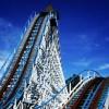
I'd make the station roof a the muted red so it has a little more difference cuz now it blends too much imo, it distracts from the track and really looks like a big red box and has no defenition next to the track, it blends too much really I think
BelgianGuy
Offline
I'd make the station roof a the muted red so it has a little more difference cuz now it blends too much imo, it distracts from the track and really looks like a big red box and has no defenition next to the track, it blends too much really I think -
 Corkscrewy
Offline
I'd go with a different color completely I think.. Break it up some. Maybe a light blue? or orange? idk. mix it up a bit.
Corkscrewy
Offline
I'd go with a different color completely I think.. Break it up some. Maybe a light blue? or orange? idk. mix it up a bit. -
Louis!
Offline
I'd say go for the pastel red for the roof.
Or don't listen to anyone, you've done wonders with this park with your own judgment, if you trust it, that's all that matters
-
Airtime Offline
As Louis said, if you think the reds fine keep it. Another opinion helps though I find.
If anything I think black would suit it like you have a roof in that screen that's black. Or pale red? I like this red though.
Love the screen. Amazing stuff. Colourful and realistic just right.
Can't wait for this. So excited to see it in full.
Oh and under the queue awnings, is there any queue line fence for the cattle pen? I can't see it
-
 hulkpower25
Offline
Excellent job on that last screen, but i agree with BelgianGuy about the station roof
hulkpower25
Offline
Excellent job on that last screen, but i agree with BelgianGuy about the station roof -
 wheres_walto
Offline
If we're debating roof color, I'd go with black over what you currently have. As always, the work here is top notch and improving. Can't wait to see the reactions when people see what year you're on in-game.
wheres_walto
Offline
If we're debating roof color, I'd go with black over what you currently have. As always, the work here is top notch and improving. Can't wait to see the reactions when people see what year you're on in-game. -
imawesome1124
Offline
That's an amazing screen, but I agree with BelgianGuy about changing the roof color to the "soft" red, it blends in with the track too much as it is right now. I am eagerly waiting for this to be released.
-

Disney Imagineer Offline
I think black would be a nice choice for the station's roof color, it would give a nice solid contrast from the red. That last screen is awesome...so much eye candy. Great park!


Tags
- No Tags