(Archive) Advertising District / Disneyland
-
 04-November 11
-
 Liampie
Offline
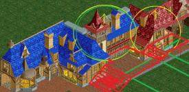
I think you need more foliage or no foliage at all. Either way, spice up the paths!
Liampie
Offline
I think you need more foliage or no foliage at all. Either way, spice up the paths!
First screen is fantastic, second screen doesn't show much unfortunately. -
 disneylandian192
Offline
Thanks Liampie! I can't stand the second screen either, thats why its here... for motivation and ideas.
disneylandian192
Offline
Thanks Liampie! I can't stand the second screen either, thats why its here... for motivation and ideas. -
 Nokia
Offline
It'd look weird if there was more foliage, or just foliage in general, in the space area. It's space not the jungle.
Nokia
Offline
It'd look weird if there was more foliage, or just foliage in general, in the space area. It's space not the jungle.
I love the first screen though, the way you incorporated everything. gaah. -
 highroll3r
Offline
in the second screen i think you should make the enterance more spacious. it also is too square, the path. bulge it inwards and make the right planter, the monorail track go around the corner. first screen is nice!
highroll3r
Offline
in the second screen i think you should make the enterance more spacious. it also is too square, the path. bulge it inwards and make the right planter, the monorail track go around the corner. first screen is nice! -
Liampie
Offline
Thanks Liampie! I can't stand the second screen either, thats why its here... for motivation and ideas.
Okay here are some more thoughts:
- Give the ride entrance more grandeur, and get rid of the sign in front. The sign looks cool but it's in the wrong place because it blocks the view.
- The 'blocky' way you used the different path types clashes horribly with the smooth curves of the building. Stick to one path type to hide the game's grid!
- Add some features to the path like custom lights and places to sit.
- Spice up that wall! Is it a heavily themed ride or a warehouse?
- Colours in sight, not grey in sight and colour on the roof!
- Tits are always a good idea -
 Phatage
Offline
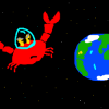
I think Liampie has the right idea here. The fact that that sun has only one planet rotating around it is an almost literal microcosm (or lack thereof?) of what's missing these screens.
Phatage
Offline
I think Liampie has the right idea here. The fact that that sun has only one planet rotating around it is an almost literal microcosm (or lack thereof?) of what's missing these screens. -
 posix
Offline
I'm always a fan of multi-storey buildings. Very nicely done. I feel it might be a bit too full of path and thus is too grey. Maybe contrast the greys between path and building structure a little better to avoid that.
posix
Offline
I'm always a fan of multi-storey buildings. Very nicely done. I feel it might be a bit too full of path and thus is too grey. Maybe contrast the greys between path and building structure a little better to avoid that. -
 Maurice3
Offline
Wow, I really like your tommorow land, where did you get the Space Mountain cars at the entrance from?
Maurice3
Offline
Wow, I really like your tommorow land, where did you get the Space Mountain cars at the entrance from? -
 Xophe
Offline
For some reason I really love the white pillars holding up the upper level in the first screen. And the seating area underneath is really nice. It kinda reminds me of a space-age Getty Center haha.
Xophe
Offline
For some reason I really love the white pillars holding up the upper level in the first screen. And the seating area underneath is really nice. It kinda reminds me of a space-age Getty Center haha.
As for the second screen, I agree that you need a much grander entrance behind the sign (which is really cool). Rather than that tiny gold tube going into the building, try making a wider opening with some info signs and maybe a test seat or something to add detail. -
disneylandian192
Offline
Happy 50th year in game!

Enjoy a meal at the bavarian themed Pinnochio's Village Haus.
-
 Cocoa
Offline
add some tables and chairs and maybe a menu stand to make me know its a restaurant. other than that, amazing work. I haven't seen blue rooves work that well before.
Cocoa
Offline
add some tables and chairs and maybe a menu stand to make me know its a restaurant. other than that, amazing work. I haven't seen blue rooves work that well before. -
highroll3r
Offline
^i agree. i think land elevation wouldnt hurt either. if those building were on a sloping path it would add so much more class. just a thought.
edit:
-
 ScOtLaNdS_FiNeSt
Offline
Yes very very good, All we need is chipitole or whatever his name is in the bottom left window of the screen
ScOtLaNdS_FiNeSt
Offline
Yes very very good, All we need is chipitole or whatever his name is in the bottom left window of the screen Yeah should do what highroller suggested even from the screen he posted it would defo look better
-
Liampie
Offline
Good idea, highroll3r. your screen already looks better than disneylandian192's, because the placement of that first stairs is great. Do it, disneylandian192 (jesus guys, can't you pick easier names?), and maybe use map object manipulation in 8cars to raise whole tiles of scenery with one simple click.
I like it, anyway. It's crazy how you improved so quick and all of a sudden you had a style of your own. I see a bright future for you! -
 robbie92
Offline
I don't think it needs stairs. Part of the wonder of Disneyland is the overall accessibility and the fact that they made such great atmosphere from what was essentially flat farmland. I think that the one big improvement this screen needs to make it really pop would be planters and foliage of some kind. Liam's trees could help give you a good sense the charming scale that Disneyland has through its smallness.
robbie92
Offline
I don't think it needs stairs. Part of the wonder of Disneyland is the overall accessibility and the fact that they made such great atmosphere from what was essentially flat farmland. I think that the one big improvement this screen needs to make it really pop would be planters and foliage of some kind. Liam's trees could help give you a good sense the charming scale that Disneyland has through its smallness. -
 Cena
Offline
Cena
Offline
^i agree. i think land elevation wouldnt hurt either. if those building were on a sloping path it would add so much more class. just a thought.edit:
Bad idea.I don't think it needs stairs. Part of the wonder of Disneyland is the overall accessibility and the fact that they made such great atmosphere from what was essentially flat farmland. I think that the one big improvement this screen needs to make it really pop would be planters and foliage of some kind. Liam's trees could help give you a good sense the charming scale that Disneyland has through its smallness.
Good idea.
Plus the fack that Disney has the Utilidors under whole Disneyland ... it's one of those things that benefits from flat land.
Disneylandian is going for 1:1 copy from Disney, so he should stick to the core of Disney in that case. And by addíng hills / stairs / land elevation, you would ruin it. It might look better, its less realistic.
About the screen, I like it, but you might want to show more, otherwise it might get a too much 'gijssie' feel of showing screens (aka, unfinishedness). Goodluck Disneylandian


Tags
- No Tags