(Archive) Advertising District / Au Naturel
-
 17-March 12
-
 posix
Offline
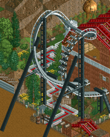
One concern I forgot to mention: I think you need to be careful with the rocky landscape everywhere. You do it a little bit too much for me and it causes your themes to look somewhat "over-earthy".
posix
Offline
One concern I forgot to mention: I think you need to be careful with the rocky landscape everywhere. You do it a little bit too much for me and it causes your themes to look somewhat "over-earthy". -
 gir
Offline
gir
Offline
Georgia Scorcher does this and it works well.
I'm not sure what the bank on the bunny hop is for. -
 Six Frags
Offline
Great screens Loopy!
Six Frags
Offline
Great screens Loopy!
I hope you'll stick with the custom supporting on all of the coasters and support everything so that none of the original supports are visible, as that's what really makes a LL park stand out for me personally.
The atmosphere is great, I can really envision being there! -
 Hepta
Offline
I really like the bank on the bunny hop. Bankings like that are common on real coasters, but rarely seen in RCT, probably because it's not visually logical in the game.
Hepta
Offline
I really like the bank on the bunny hop. Bankings like that are common on real coasters, but rarely seen in RCT, probably because it's not visually logical in the game.
Obviously not a major innovation, but to me, it's a nice touch />
/>
-
 Fizzix
Offline
Even though I don't play LL, it's really nice to see some beautiful LL is still happening.
Fizzix
Offline
Even though I don't play LL, it's really nice to see some beautiful LL is still happening. -
Airtime Offline
Wow oh wow. You make it look effortless. Loopy you make me want to play LL.
Bit of an odd statement but one thing that I think you do perfectly is being able to leave the right amount of clear grass space around parks something that I try to do but find extremely difficult. I love to see plain grass.
So excited for this. So much. -
 Loopy
Offline
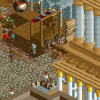
Thanks for all the comments guys. Being as it's Christmas, here's a quick teaser screen of one of the work in progress coasters:
Loopy
Offline
Thanks for all the comments guys. Being as it's Christmas, here's a quick teaser screen of one of the work in progress coasters:
Hope you all have a fantastic Christmas! -
 Liampie
Offline
That's a huge barn, and honestly I don't like the coaster's colours very much. But otherwise well done. Very clean, yet detailed. Love the scarecrow, even though the head is way too big. No, I actually I love it especially because the head is way too big.
Liampie
Offline
That's a huge barn, and honestly I don't like the coaster's colours very much. But otherwise well done. Very clean, yet detailed. Love the scarecrow, even though the head is way too big. No, I actually I love it especially because the head is way too big.
-
 FK+Coastermind
Offline
Agree on coasters colors being abit boring. Everything else looks fantastic, this park just looks so wonderfully wonderful!
FK+Coastermind
Offline
Agree on coasters colors being abit boring. Everything else looks fantastic, this park just looks so wonderfully wonderful!
FK -
 Sulakke
Offline
Very nice, but the barn would look better if it's somewhat smaller. Now you've got the same problem as the mansion in Raven I think...
Sulakke
Offline
Very nice, but the barn would look better if it's somewhat smaller. Now you've got the same problem as the mansion in Raven I think... -
 Evil WME
Offline
I especially like the very first screen. The atmosphere you're creating with the stacked objects is very impressive!
Evil WME
Offline
I especially like the very first screen. The atmosphere you're creating with the stacked objects is very impressive! -
Airtime Offline
Are they supposed to be lockers on the left of the screen?
Great screen but I also think the barn is to big. I kind of worry that it may subtract from the area because the scale looks big. It's at least a couple of stories too tall.
You make me want to play LL. Stop it please


Tags
- No Tags