(Archive) Advertising District / Zac's/ Shotguns?'s stuff thread.
-
 13-May 12
-
 Xeccah
Offline
Xeccah
Offline
Yes! Clean architecture!
No, I love it. Blast from the past!
I was hoping for an 04' RCT2 park feel.
Thanks for that last piece of advice to clean it up. I replaced that area with this and I say this looks TONS better. -
 posix
Offline
Wow, I totally love it ... PLEASE finish!
posix
Offline
Wow, I totally love it ... PLEASE finish!
The queue over the bridge is so wonderful. The whole composition works hand in hand everywhere. It's great.
Is this a full blown park project? What other areas do you have planned? Or is it something smaller? -
 trav
Offline
I think it's great, I think there are a few things that could be improved like I don't like that tiled path, but really, good work. Haven't seen anything like this in years.
trav
Offline
I think it's great, I think there are a few things that could be improved like I don't like that tiled path, but really, good work. Haven't seen anything like this in years. -
Xeccah
Offline
Wow, I totally love it ... PLEASE finish!
The queue over the bridge is so wonderful. The whole composition works hand in hand everywhere. It's great.
Is this a full blown park project? What other areas do you have planned? Or is it something smaller?
128X128, full park . -
 Cocoa
Offline
your probably one of the better 'new' members around here, in terms of progress. you have seriously stepped up your game with every screen, and I can tell you are really trying to improve and listen to criticism. its nice to see
Cocoa
Offline
your probably one of the better 'new' members around here, in terms of progress. you have seriously stepped up your game with every screen, and I can tell you are really trying to improve and listen to criticism. its nice to see
-
Xeccah
Offline
your probably one of the better 'new' members around here, in terms of progress. you have seriously stepped up your game with every screen, and I can tell you are really trying to improve and listen to criticism. its nice to see
Well, thank you. I am really getting inspired by old style parks. They seem to have the right amount of detail to amp the atmosphere without overdoing it. I am particularly like Turtle's spotlight Bijou Magique ( for its atmosphere) and also SA's RoB (for its overall composition). -
Xeccah
Offline
This is just a teaser screen. Full update including two new finished parts, and the entrance area. I hope people look at what I said below because its a bit different.
Hope you like this screen,
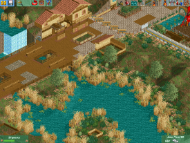
Ill be done with this area in a few days, maybe a week.
Zac.
Edit: scratch this screen. I can do better than this. -
 Liampie
Offline
You can do better than this. Architecture is a step down from that previous screen and the foliage has dull colours and desperately asks for a few higher trees. Path textures are a mess.
Liampie
Offline
You can do better than this. Architecture is a step down from that previous screen and the foliage has dull colours and desperately asks for a few higher trees. Path textures are a mess. -
 Ruben
Offline
I agree with Liam about the path textures, but I have to disagree on the foliage. I think that (in this specific case) it has the right effect. Only thing I'd suggest about the foliage is placing the willows in the flower beds/shrubbery instead of behind them. That'd make it look more natural.
Ruben
Offline
I agree with Liam about the path textures, but I have to disagree on the foliage. I think that (in this specific case) it has the right effect. Only thing I'd suggest about the foliage is placing the willows in the flower beds/shrubbery instead of behind them. That'd make it look more natural.
As for archy... it's better than what you've shown before, but not as good as what you've shown in the post right before this one. It's just kinda messy. Overall I've gotta say: You've got something different going on, and I enjoy it.
-
 Ling
Offline
For the most part the arrangement of the foliage was good, though. Maybe a few too many different plants, and the wheat-looking ones should probably not be on the water. But other than that.
Ling
Offline
For the most part the arrangement of the foliage was good, though. Maybe a few too many different plants, and the wheat-looking ones should probably not be on the water. But other than that. -
 Fizzix
Offline
I like the dried up/dead foliage, although too much of it isn't a good thing. Why not try to add some shrubs underwater? I don't like the tall buildings with the small footprints, change those. You said you went with a previous save, so hopefully you fixed this stuff already.
Fizzix
Offline
I like the dried up/dead foliage, although too much of it isn't a good thing. Why not try to add some shrubs underwater? I don't like the tall buildings with the small footprints, change those. You said you went with a previous save, so hopefully you fixed this stuff already.
-
posix
Offline
I agree you can do better. I mean, it's not bad at all, but where's the substance this time? Foliage and water come secondary... maybe tertiary. Put logic and well thought out attractions first.
-
Xeccah
Offline
I agree you can do better. I mean, it's not bad at all, but where's the substance this time? Foliage and water come secondary... maybe tertiary. Put logic and well thought out attractions first.
As I said, this no longer exists.
Edit: What I have replaced that with look so much more impressive. -
Xeccah
Offline
Is this much of an improvment? This is what I will replace that crap in the previous screen with. The holes in the walls is because I have not yet zero clearanced it in.
I do know that this is a quite unfinished screen, but I want to see if this is better than last screen.
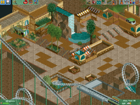
Hope you like it more than last,
Zac. -
Ruben
Offline
To me it's really too unfinished to comment on. It's definitely more interesting, as there's more going on. Qualitywise I'd need to see more.
Oh and please don't listen to this:...Foliage and water come secondary... maybe tertiary.
Atmosphere (=mostly Foliage/landscaping) is of major importance. Furthermore, what does he know? I mean, he's only admin and #9 of all times at this site. Clearly you'd better listen to me and disregard his comment.


Tags
- No Tags