(Archive) Advertising District / The Mrbuckeye park thread (official)
-
 21-June 12
-

 Scoop
Offline
Some of the color choices are terrible, like that purple and brown building with the white roof and the bright red building. The layout isn't half bad but could use some work, especially the ending.
Like I've been telling everyone who is asking for feedback... LOOK AT REAL LIFE ARCHITECTURE!! Do you see anything in real-life (that you'd want to replicate in RCT) that looks like what you're building? Probably not! First step: type in your favorite amusement park name into google search. Click images. LOOK at the images for inspiration and PAY ATTENTION to what makes the buildings look pleasing/interesting. Replicate those ideas with your own twist in the game! It's not that hard, really... Don't just build a rectangle, put a roof on it and ask for feedback...
Sorry if this is harsh, it's not only directed towards you mrbuckeye, but I for one am pretty tired of these kind of posts filling the Advertising district. I completely agree with Pacificoaster: try a bit harder. It really isn't difficult if you took your time.
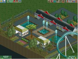
Boy are you guys right im doing great now just because i have taken my time. Just look at this. it is so much better than what i had previously done.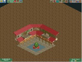
thanks again everyone for the motivation to try harder. -

 Ling
Offline
Needs a purpose, is all. Also, the benches do NOT fit at all - neither do those tree's colors.
 -

 Ruben
Offline
Although Ling is right in each and every point of critique (the benches, the trees, the lack of purpose) I think there's óne important part missing in that comment, being:
As compared to your previous work this is an enormous improvement! You've really listened, and now you've seen what it can do. Please keep this up, keep putting real effort in, and listen to more experienced players. Seeing how by doing so you improved significantly in a matter of days, you'll get there.
-

 trav
Offline
You need to stop building to show screens. It means your work has no purpose and no thought behind it other than 'I'm going to try and build something that looks nice to impress the people over at NE'.
I guarantee you that as soon as you step back and start thinking about what you're building and plan it out fully, things will come to you much faster. Look at Shotguns, he seems to have done that and has improved so quickly it's unreal. -

 BC(rct2)
Offline
That shrub in the middle is not the best choice, try others, and other color too.
Btw, show us something finished or almost finished, then we can help you more because we have (or not) more details, things to comment about
-

 Xeccah
Offline
Although Ling is right in each and every point of critique (the benches, the trees, the lack of purpose) I think there's óne important part missing in that comment, being:
As compared to your previous work this is an enormous improvement! You've really listened, and now you've seen what it can do. Please keep this up, keep putting real effort in, and listen to more experienced players. Seeing how by doing so you improved significantly in a matter of days, you'll get there.
Your about to hit the point where you'll do really really good. -

 Scoop
Offline
You need to stop building to show screens. It means your work has no purpose and no thought behind it other than 'I'm going to try and build something that looks nice to impress the people over at NE'.
I guarantee you that as soon as you step back and start thinking about what you're building and plan it out fully, things will come to you much faster. Look at Shotguns, he seems to have done that and has improved so quickly it's unreal.
no trav that isn't why i posted this. I posted this to thank you guys for all of the help not for the advice Not that i don't want it though.
-

 AvanineCommuter
Offline
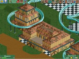
That is definitely an improvement but there are things to improve on still:
1. What is the purpose of that building?
2. The facade suggests that the building will be pretty large; how do you expect to finish the backsides? You could break it up and make a more pleasing composition of smaller facades.
3. Try to show a finished screen; our advice would be a lot more helpful if half the screen isn't grass/dirt. -

 Arjan v l
Offline
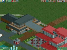
Red and grey isn't the best combination on that building ,grey-brownish or grey -greenish or grey with blue would be better i.m.o. ,for the bridge: have you ever tried to use pathblocks with invisible footpathing? That will give you more options.
 -

 Scoop
Offline
well no all i want is just a better color for the covered bridge that will be there. thanks for the suggestion however.
 -

 Cocoa
Offline
for the building above, the red/grey building is OK but I don't see why the brown building exists. seems unneccessary, especially the really wide bridge.
 -

 BC(rct2)
Offline
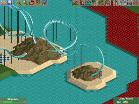
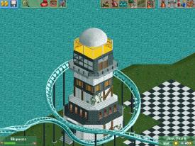
Finally good screens! I see progress on this, but try to put different textures on the walls and various details. You are getting better, slowly, but better
-

 AvanineCommuter
Offline
I'm glad that you are taking a new approach to the feedback here! I am sure you will improve by taking in feedback and putting in honest effort and work.
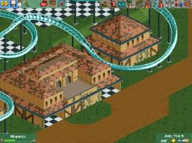
You are showing new ideas from what you've been showing before and that's a great step forward. I think you should reconsider the scale of the buildings though. Smaller buildings with more overall thought in composition would help; as of right now, those buildings are too large with too few details.
The way I improved was 1. look at real life architecture that I wanted to emulate in the game, and 2. work through sketches and try to realize those sketches with the palette of CSO in the game. As of right now it doesn't look like you had a clear plan in mind when making those buildings; what are they supposed to house, and what style of architecture is it? What kind of park/design are you looking to build? Is there a theme? -

 Scoop
Offline
ok thanks for the positive feedback its nice to finally see that. umm my question: Are the buildings encompassed by the coaster too big because I'm not sure how to make them smaller without them looking bad. Or is it just the big building between the two.
 Tags
Tags
- No Tags
