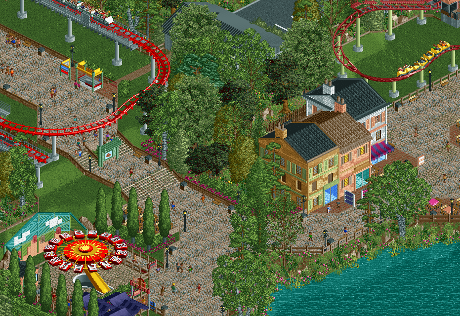
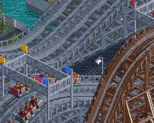
yeah to be honest I don't really like this screen very much. the architecture there is pretty bad and flat, not to mention sort of theme-less and has no real meaning as structures in a theme park. otherwise its just more foliage and grasss which is fine, same as all the rest of your stuff, but just doesn't really excite me or anything. most semi-competent builders can put together some acceptable grass and foliage, and I know that you're capable of a looot more than this (I'm one your bigger fans these days so take it from me I guess? IDK)
the flat looks fine but overall there's just not much going on here, it just seems empty and atmosphere-less.
Perhaps this is a better angle? Not sure why I didn't use this one initially to be honest.
But I can understand what you are saying, my attempt to replicate modern Italian apartment blocks was probably a bad idea. I've had a huge lack of inspiration on this park lately, battling my own urge to build despite having almost no ideas. Which is why this probably why this park has slowly gone downhill. The park might be better to view in game, than these smaller screens, due to the composition, but I'm still largely unhappy with the way its turned out.
I think replacing the buildings with something more standard will be the best choice, but I have no idea what that would be at the moment so who knows.
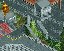
I do like the wall feature by the enterprise, but there just doesn't seem to be any context for the rest of the area. Why are there three Italian apartment blocks there? You're lacking area differentiation in this park I think. The foliage is basically always the same, and without a change in path or clear signage it's really difficult to see where areas begin/end. At least from a screen this size.
It's a good screen but it doesn't really give me an Italian vibe. Why would a theme park build appartment buildings instead of more cute idyllic Italian houses full of arches and flowers?
This is why I dont post screens that much anymore, 4.5 or 13 comments area actually useful and on topic. Also chemist, please dont start arguments in my screenshots anymore, I'm sick of it.
Thanks to Liam, Faas, Cocoa, and Stoksy. I'll probably re-do most of this area to be more cohesive and immersive. I was pretty unhappy with most of this like I said so I just wanted to get some outside opinions.
The fuck are you talking about? I was saying your screen is good. Are you delusional? I didn't start anything at all.
I'm sorry gforce, you put time and effort into your screens and you just get a shit show. I feel bad and am mad just to see what seems to only happen on your screens.
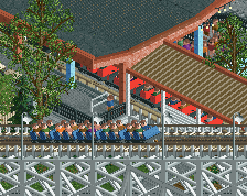
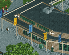
As for the screen I think it's nice but just out of place and rushed. Some refining would greatly help this little area. Another thing I don't like is the queue to the caos the tents don't do it for me.
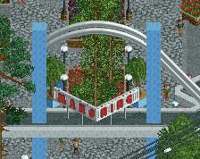
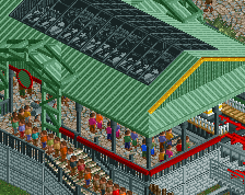
I don't think it's sloppy at all. He's obviously tried hard on many parts of this. It sometimes works and pays off, but overall I just find it too clinical. All the lines in this are razor sharp and overly clean. I think you really need more "organic". I know that's not you, but I think it could be interesting what happens when you try to interpret it. More rocks, less painstaking details (which often are a bit needless to be honest), more macro-thinking: the grand whole over the individual bit. It'll make it more coherent and flowing.
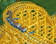
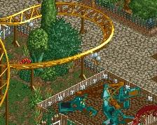
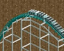
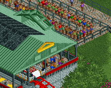
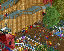
Lynx, a vekoma Jr. coaster named after the Mediterranean endangered cat. Also shown is Gladiator, a chance Chaos, named after the famous warriors of the Roman empire.
 25-March 16
Let the comment war begin
yeah to be honest I don't really like this screen very much. the architecture there is pretty bad and flat, not to mention sort of theme-less and has no real meaning as structures in a theme park. otherwise its just more foliage and grasss which is fine, same as all the rest of your stuff, but just doesn't really excite me or anything. most semi-competent builders can put together some acceptable grass and foliage, and I know that you're capable of a looot more than this (I'm one your bigger fans these days so take it from me I guess? IDK)
the flat looks fine but overall there's just not much going on here, it just seems empty and atmosphere-less.
Perhaps this is a better angle? Not sure why I didn't use this one initially to be honest.
But I can understand what you are saying, my attempt to replicate modern Italian apartment blocks was probably a bad idea. I've had a huge lack of inspiration on this park lately, battling my own urge to build despite having almost no ideas. Which is why this probably why this park has slowly gone downhill. The park might be better to view in game, than these smaller screens, due to the composition, but I'm still largely unhappy with the way its turned out.
I think replacing the buildings with something more standard will be the best choice, but I have no idea what that would be at the moment so who knows.
Bad angle for the screen, I agree.
I do like the wall feature by the enterprise, but there just doesn't seem to be any context for the rest of the area. Why are there three Italian apartment blocks there? You're lacking area differentiation in this park I think. The foliage is basically always the same, and without a change in path or clear signage it's really difficult to see where areas begin/end. At least from a screen this size.
Burger Bar
It's a good screen but it doesn't really give me an Italian vibe. Why would a theme park build appartment buildings instead of more cute idyllic Italian houses full of arches and flowers?
Very mellow compared to how you usually build. Nothing wrong with that, I think it looks fine guys.
GeForce you see what I mean by getting low ratings on a decent/above average screen. Its nothing wrong with this but it got low rating?
The rating system makes me think like a grade system. 50% = D? lol
This is why I dont post screens that much anymore, 4.5 or 13 comments area actually useful and on topic. Also chemist, please dont start arguments in my screenshots anymore, I'm sick of it.
Thanks to Liam, Faas, Cocoa, and Stoksy. I'll probably re-do most of this area to be more cohesive and immersive. I was pretty unhappy with most of this like I said so I just wanted to get some outside opinions.
If you want to stick to Italian, may I suggest a Venetian theme? Looks like you got the water for it already.
The fuck are you talking about? I was saying your screen is good. Are you delusional? I didn't start anything at all.
As for the screen I think it's nice but just out of place and rushed. Some refining would greatly help this little area. Another thing I don't like is the queue to the caos the tents don't do it for me.
I don't think it's sloppy at all. He's obviously tried hard on many parts of this. It sometimes works and pays off, but overall I just find it too clinical. All the lines in this are razor sharp and overly clean. I think you really need more "organic". I know that's not you, but I think it could be interesting what happens when you try to interpret it. More rocks, less painstaking details (which often are a bit needless to be honest), more macro-thinking: the grand whole over the individual bit. It'll make it more coherent and flowing.