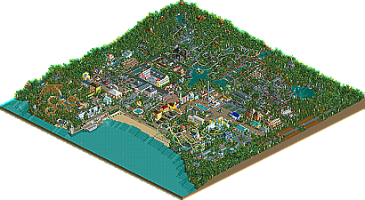
Park / Portmeirion Village

Park_2325 Portmeirion Village

113 Comments

  • Mike Robbins%s's Photo

    I really dislike this park. Especially because it's coming from good parkmakers who made parks like Myths, Legends, and Folklore.

    So every RCTM park should look like MLF?
  • CoasterWizard%s's Photo
    I like the part where the suspended flies over the water 'pool' in the second screen. Unfortunately, that's all I really like.
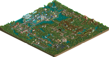
    The actual garden, or lawn looks rather messy. If you are going to do a lawn, make it mostly grass so everything can be mowed and have the odd tree or two. Right now, there are large shrubs scattered all over the place, and it really ruins the feel of the screen.
    The coaster colours seem a little too contrasting as well, but it's not anything serious that distracts the eye.
    Edit: The jungle shrubs really don't fit in. Consider removing them.
  • Panoramical%s's Photo
    No offence, but this park looks retarded. And i think that partly because of your attitude to it mike.
  • BchillerR%s's Photo

    So every RCTM park should look like MLF?


    ......

    No offence, but this park looks retarded. And i think that partly because of your attitude to it mike.


    I agree.


    BchillerR
  • yeshli2nuts%s's Photo

    So evert RCTM park should look like MLF?

    no, but imo that is one of the best (rct2) parks i've ever seen and while its obvious all your parks dont have to look like it, it should be as good as it.
  • deanosrs%s's Photo
    The problem Mike, is that they do... in my opinion anyway.

    The latest screens are really bad imo. The suspended's colour hurts, and the buildings look like they're made out of lego. Sorry, but I don't like it.
  • Steve%s's Photo
    The gardens looks fantastic. But the coaster totally ruins it for me. Find a new color scheme for it.
  • John%s's Photo
    Mike, you honestly wonder why people don't like you or your parks?
    You are arrogant, condescending and irrespective.
    Get off your self-appointed pedestal and maybe people will lighten up a bit.
  • A14504%s's Photo
    it's realistic, but to improve the landscapeing, try not to have every thing all spread out evenly. plants grow in clumps in the wild. so unless it's some sort of man made garden (which the first screen doesn't seem to be) think about what I said.

    other than that.... this park is most definatly a park u need to see finished and in whole. I think that the flow and overall feel/veiw of this park is what is going to show that it is made by the masters.
  • Panoramical%s's Photo

    Mike, you honestly wonder why people don't like you or your parks? 
    You are arrogant, condescending and irrespective.
    Get off your self-appointed pedestal and maybe people will lighten up a bit.

    Exactly.
  • SFAW Fan%s's Photo

    Mike, you honestly wonder why people don't like you or your parks? 
    You are arrogant, condescending and irrespective.
    Get off your self-appointed pedestal and maybe people will lighten up a bit.

    Finish something before you talk shit. The coaster looks awesome.
  • Jacko Shanty%s's Photo
    I like the first three screens in this topic the best..

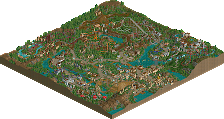
    Screen 1: I like what you're doing with color. The only real thing that sticks out for me is the dark brown.. the whole section is living with bright pastels and then there's... brown, right in the middle.

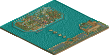
    Screen 2: My favorite. Looks like rwadams.. very realistic and I love the landscape.

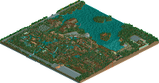
    Screen 3: I left you my comments at rct2.com, but the only real thing that sticks out is the boat.. looks like a Fischer Price toy.

    But the last two screens are really.. disappointing. Using "Classic Mama Bear" as an excuse is a crock, IMO, because I was never a fan of her work. The vines look really bad all over the place.. the scenery is random - some of it cartoony. It just looks very amateur. A lot of basic things are missing. Change the tarmac under paths, the bright red of the coaster sticks out, landscaping needs to be scattered a bit more, no custom supports on the coaster.. etc. Maybe there's something else there that I don't see.. but personally, it doesn't work.
  • JKay%s's Photo
    The archy reminds me of the Harry Potter parks on RCT2.com which instantly makes not a fan....The invert coaster looks okay I guess, though I'm not really liking the colors of it....I have very mixed feelings about this park, like deano said, I think the lack of toon/fm scenery is hurting it more than anything.....
  • Panoramical%s's Photo

    Mike, you honestly wonder why people don't like you or your parks? 
    You are arrogant, condescending and irrespective.
    Get off your self-appointed pedestal and maybe people will lighten up a bit.

    Finish something before you talk shit. The coaster looks awesome.

    What the fuck? What the hell has finishing parks got to do with attitude?
  • John%s's Photo
    SFAW Fan, you're terrible at trying to pick fights.
    If finishing parks had any revelance to the conversation, I might be willing to discuss.

    Nice try.
  • Rct Flame%s's Photo
    Pardon me as I go against the current and state that I'm really starting to like this park a lot.
  • Turtleman%s's Photo
    I like it because you used grass. I mean people rarely use grass like that. It really is depressing.
  • penguinBOB%s's Photo
    The colors for the coaster stand out too much... Maybe the dull red with different support colors? I dunno...

    The rest looks good though.
  • Mike Robbins%s's Photo

    Mike, you honestly wonder why people don't like you or your parks? 
    You are arrogant, condescending and irrespective.
    Get off your self-appointed pedestal and maybe people will lighten up a bit.

    No I don't actually. I really don't care what complete strangers think of me. I'm not losing any sleep over it. As long as me, Mama Bear, and Roger like it is the only thing I care about. We don't want to change our parkmaking style like 99% of the members at this site just to fit in and to impress people. I'm already impressed with MB and Rog's works and this park has been fun to build. THAT's what I care about.

    The colors for the coaster stand out too much... Maybe the dull red with different support colors?

    We've already discussed going with the duller red to give it more of a ruined look to it.
  • BchillerR%s's Photo

    Mike, you honestly wonder why people don't like you or your parks? 
    You are arrogant, condescending and irrespective.
    Get off your self-appointed pedestal and maybe people will lighten up a bit.

    No I don't actually. I really don't care what complete strangers think of me. I'm not losing any sleep over it. As long as me, Mama Bear, and Roger like it is the only thing I care about. We don't want to change our parkmaking style like 99% of the members at this site just to fit in and to impress people. I'm already impressed with MB and Rog's works and this park has been fun to build. THAT's what I care about.


    We've already discussed going with the duller red to give it more of a ruined look to it.

    How come you were complaining about only getting only one compliment on the other page then?


    BchillerR