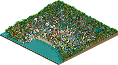
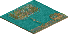
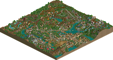
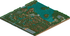
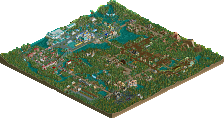
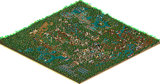
Park / Portmeirion Village

Park_2325 Portmeirion Village

113 Comments

  • hxzero%s's Photo
    The castle looks like a cheap...minigolf castle. And those colors are past bold, they're at the "bad" point. Change the green to the dull forest green or the red to the faded-type red.
  • Mike Robbins%s's Photo
    ^ The bright coaster colors are now gone. I have used the duller colors to tone it down.
  • RCT_Master%s's Photo

    The colors for the coaster stand out too much...  Maybe the dull red with different support colors?

    Are you on CRACK or something? Coasters are supposed to stand out. They're the best thrill rides in any park! The colors look fine and so does the park. I like it.
  • John%s's Photo

    Are you on CRACK or something?

    Is a question like that revelant to the conversation?
    Roller coasters don't have to stand out.
  • RCT_Master%s's Photo

    Is a question like that revelant to the conversation?
    Roller coasters don't have to stand out.

    If you owned a major theme park, wouldn't you make the coasters stand out? I know I would.
  • Panic%s's Photo
    Usually better to have them blend in nicely.
    For example, you don't often see a dark blue Beemer in a desert-themed section.
    Look at the runner-up Tula City, the main inverter was red and yellow while the buildings around it were beige and purple. This was a negative in Iris' mind.
    Even fantasy parkmakers now usually make their rides blend in.
  • John%s's Photo

    Is a question like that revelant to the conversation?
    Roller coasters don't have to stand out.

    If you owned a major theme park, wouldn't you make the coasters stand out? I know I would.

    No, because that doesn't make the ride any better.
  • Turtle%s's Photo

    Usually better to have them blend in nicely.
    For example, you don't often see a dark blue Beemer in a desert-themed section.
    Look at the runner-up Tula City, the main inverter was red and yellow while the buildings around it were beige and purple. This was a negative in Iris' mind.
    Even fantasy parkmakers now usually make their rides blend in.

    Too true...
  • Silenced%s's Photo

    Usually better to have them blend in nicely.
    For example, you don't often see a dark blue Beemer in a desert-themed section.
    Look at the runner-up Tula City, the main inverter was red and yellow while the buildings around it were beige and purple. This was a negative in Iris' mind.
    Even fantasy parkmakers now usually make their rides blend in.

    The only reason it would be blue would be because of the theme of the desert, some aren't just bare open land. And in deserts, a tan coaster looks too dull.


    Knuckles 8@
  • Mike Robbins%s's Photo
    Posted Image

    Posted Image
  • guljam%s's Photo
    I like this!
    I used to dream(ing?) this Fantasy Village lol!

    Realistic! You're good! :angel:
  • JKay%s's Photo
    For the most part I like this Mike, but as guljam said, it looks more like a Fantasy Village than a theme park...but maybe that was your intention, you did good job if so. I really like the architecture on peach & tiele buildings in the second screen.
  • hxzero%s's Photo
    I like it. It's very pretty, very soft, very....nice. It looks like a place where all the blankets are white cotton and a cool breeze always blows. And all the people are beautiful.
  • Powersun%s's Photo
    It looks very very good.

    The colours are so soft.
    The orange with the white is a dream.
    The Archy is very good too.

    Good job

    Powersun
  • Mike Robbins%s's Photo

    it looks more like a Fantasy Village than a theme park...

    That's our intention, to create the same atmosphere as the actual Portmeirion Village, not a typical theme park. We recreate some of the buildings, but most of the park is to represent the feel of the village. Glad you like them so far. By the way, both of these screens are Mama Bears work.
  • Steve%s's Photo

    By the way, both of these screens are Mama Bears work.

    Uh, wow. I must say they are quite excellent.
    I'm diggin' the quarter tile use in the 1st screen.
    Nice work, keep it up, or something.
  • artist%s's Photo
    Looks likes a great park you have going here but i really hate some of the custom scenery you have used.

    Keep this work up.
  • RCT_Master%s's Photo

    John & gymkid echoed.....Mike, if you play RCT for fun, than why are you so defensive about your parks???.....a real parkmaker is able to accept and apply criticism, not be a defenisive little whore about it....

    OOOOOOOOOOOOOOOOOOH...Diss! Go Jkay, lol. Well, anyway, I like the park. Some of the colors might not work but the archy is wonderful, and the overall look is great! Keep up the good work! :D :D :D
  • Highball%s's Photo
    If he plays it for fun, then he probably doesn't care what other people think of his work. I know I don't.

    As for the park, it looks amazing. It has this quaint little village feeling down perfectly. The only thing I don't like about the first of the last two screens are the Egyptian columns. Other than that it's very, very nice.
  • Evil WME%s's Photo
    lovely. Shows where mama bear comes from..

    *National pride. :yup: