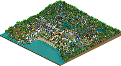
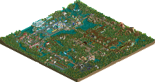
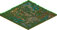
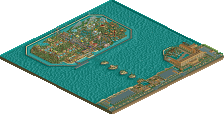
Park / Portmeirion Village

Park_2325 Portmeirion Village

113 Comments

  • gymkid dude%s's Photo

    At the hotel in Portmeirion, there is an old ship that is built into the dock. It's just part of the village.

    mike, this is kinda what people are talking about.

    I'm just saying, why post screens if you are just going to say "well, thats how the villiage is". Or "thats how the park is so dont criticize it."

    Either defend your work from comments in an intelligent way, like, "well, I think the ship is actually really good, I wanted to make it look like a stylized rectangle to give it a postmodern feel", or change it, "ya, you're right, that ship does look like a stylized rectange and we'll change it." What you are doing right now is saying "here is our park. This is the way it is. Compliment it.", and then adding to the irritation by getting on a soapbox and saying that 99% of people just want to impress iris. Good move.

    Anyways, the park isnt terrible, in fact I like that it's different, but I also think its not perfect and you could sink to the forum's lowly level of accepting comments from the "other" 99%, your highness.
  • BchillerR%s's Photo

    At the hotel in Portmeirion, there is an old ship that is built into the dock. It's just part of the village.

    mike, this is kinda what people are talking about.

    I'm just saying, why post screens if you are just going to say "well, thats how the villiage is". Or "thats how the park is so dont criticize it."

    Either defend your work from comments in an intelligent way, like, "well, I think the ship is actually really good, I wanted to make it look like a stylized rectangle to give it a postmodern feel", or change it, "ya, you're right, that ship does look like a stylized rectange and we'll change it." What you are doing right now is saying "here is our park. This is the way it is. Compliment it.", and then adding to the irritation by getting on a soapbox and saying that 99% of people just want to impress iris. Good move.

    Anyways, the park isnt terrible, in fact I like that it's different, but I also think its not perfect and you could sink to the forum's lowly level of accepting comments from the "other" 99%, your highness.

    Hahahahaha.


    BchillerR
  • rK_%s's Photo
    it all looks quite ugly and bland too me, the colors look extremly random and out of place, the sotry is nice though.
  • John%s's Photo

    No I don't actually. I really don't care what complete strangers think of me. I'm not losing any sleep over it. As long as me, Mama Bear, and Roger like it is the only thing I care about. We don't want to change our parkmaking style like 99% of the members at this site just to fit in and to impress people. I'm already impressed with MB and Rog's works and this park has been fun to build. THAT's what I care about.

    It has nothing to do with your parkmaking style, but sure.
    This is a losing battle as you OBVIOUSLY don't "get it".
  • JKay%s's Photo
    John & gymkid echoed.....Mike, if you play RCT for fun, than why are you so defensive about your parks???.....a real parkmaker is able to accept and apply criticism, not be a defenisive little whore about it....
  • MickMaximus%s's Photo
    I think the park looks really good Mike, Mama Bear, and Rwadams. Keep up the good work and I can't wait till this park is released.
  • Kevin%s's Photo
    I thought the first set of screens were terrible. All the buildings were plain and ugly, just wasn't what I would prefer. But I really do like the last set of screens somehow. The area itself looks nice, but I think it could be just a little more organized, and I think the the coaster colors don't go well with this kind of area. If those two little things were changed, then it will look awesome, to me at least.
  • PymGuy%s's Photo
    The only redeeming quality of this park is going to be rwadams.
  • sloB%s's Photo
    oh shit, no you dident.
  • Mike Robbins%s's Photo
    Two more screens, this time of the dueling inverted coasters Cymraeg Dreigiau (Welsh Dragons). The theming is still a work in progress.... right now you can see some castle ruins along with Roman type ruins. We are looking for some suggestions on what to add to the bare areas still. More ruins maybe? Let's hear some suggestions.

    Posted Image

    Posted Image
  • cBass%s's Photo
    I like the castle ruins better than the roman ruins, but I think they both work here. I like the bush and shrub choices for the open areas so far. I think some 1/4 tile ruins would also look good there, with maybe some more colors (flowers?). The roman ruins could use some transition space between ruins and foliage.

    Looking good.
  • Metropole%s's Photo
    Wow. Those castle ruins are quite excellent. The Roman ruins don't quite match up to it. I say fill the area with more castle ruins because they really work for me. The foliage is also well thought out. However, I don't like the colours of the coasters. A bit too Palettey for my tastes. You need to either replace the dark green or blood red for a slightly less palette like colour. Otherwise it looks a bit cartoony, and even a little cheap.

    Apart from that, excellent work!

    Metro B)
  • Richie%s's Photo
    I dont think the castle looks old, or ruin-ish ??? Maybe some vines on it could help. Are they the Hp walls? I also think that the egyption walls look out of place there...

    I think the coasters colours are too bright, and seeing as you want a ruined theme i feel darker/duller colours would be better. I do like the broken up peices in between the foilage though.
  • tyandor%s's Photo
    Sorry to say this, but I think the castle-objects suck in general... The idea is right, bur without the right objects...
  • supertrooper%s's Photo

    Sorry to say this, but I think the castle-objects suck in general... The idea is right, bur without the right objects...

    I agree. The architecture is good, but the castle objects used ruin it...they just don't look like they belong in the game. I also agree about the coaster colors. Perhaps brown or gray supports and duller colored tracks would look better...It appears too cartoony-Christmasy right now.

    supertrooper
  • CoasterWizard%s's Photo
    I actually quite like the castle objects, and that first screen is great. The rounded turret piece looks somewhat cartoony, but the ruined feel of that area more than makes up for it.
    My only complaint is the transition between the roman and castle areas..right now it seems very black and white.. I don't know how to improve on it though.. The two themes don't necessarily match really well either.
    But ya, these last two screens are my favourite of the bunch. Well done.
  • gymkid dude%s's Photo
    ya, the castle objects are the non-RCT gray. It doesnt look RCTish and ruins it IMO.

    I do like the landscaping though.
  • Silenced%s's Photo
    The castles ruin it, but the roman doesn't look to good alone. What to do, what to do... :rolleyes:
  • Mike Robbins%s's Photo

    I dont think the castle looks old, or ruin-ish  ??? Maybe some vines on it could help.

    I think the coasters colours are too bright, and seeing as you want a ruined theme i feel darker/duller colours would be better.

    Mama Bear did add some vines to some of the walls. We'll add some more to them later for sure to get that more 'ruined' look.

    The colors... Wales (the flag) primary colors are red and green. Yeah, it does look like Christmas, but they are too bright. I did think to myself that they needed to be 'dulled' down some more so we'll make the red less bright and the green that olive type of green. The supports could go from black to gray too. I think the black is a little too strong for this.


    I think the castle-objects suck in general

    I know they aren't the greatest, but they look better, and more ancient than the castle objects included in the game. To me those look a bit ordinary. I think the Time Twisters expansion pack had some new castle walls though. Maybe someone could convert them to custom scenery sometime.
  • kennywood_man%s's Photo
    i really dont like the castle theme..And that castle ruins does not fit rct at all..it looks more like early stages of age of empires.