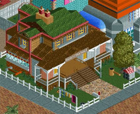
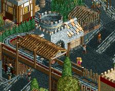
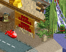
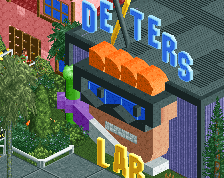
There are some really cool little things here; I especially like the kennel and mailbox, but my one major gripe with this is that I'm not sure if it really 'fits' with the surroundings. I get that it's supposed to be somewhat separate but the difference between this building and the one next to it is just too big for there to be any cohesion.
Whilst the building itself is very good, I'm not entirely sure I agree with it's positioning in relation to the other visible parts of the park.
Yeah, Stoksy, I agree with you. I originally intended to make this a more generic shop building, perhaps with giant dynamite sticks, anvils, mousetraps etc. so that it would be more blendable with other buildings, but I couldn't get that right and changed the design to this (based on snippets of the duo's house from the cartoons). However, the other buildings along this aisle are also disjointed, and I was kind of hoping that that would work as a style (as though clearly moving from one cartoon to the next), with the large turquoise building behind acting as a backdrop and separating them from the rest of the park. I definitely get what you're saying though, and still feel that this is a bit clunky. Might be able to come back to it later. Thanks for the useful input.
AndJJayMForce, yeah, I hit some real blocks with this park, resulting in clearing complete areas away because they weren't giving off the feel I'd hoped. In all honesty, I'm wondering how successful I can be in using a cartoonish game to replicate cartoons, if you get what I mean. I'll keep trying, but I get the feeling that the end result will be different from my intentions. But still, thanks for the comment
In regards to the colours and textures, Austin55, I'll take some out. As said, I was trying to stay true to the reference material, but looking at it, the peach corner supports under the awning aren't necessary. Cheers!
I think just making the green roof match the rest of the normal roofing would make it a whole lot less chaotic looking. Maybe try white for the walls on the second story, instead of the gray? Regardless, very cool.
 11-August 14
There are some really cool little things here; I especially like the kennel and mailbox, but my one major gripe with this is that I'm not sure if it really 'fits' with the surroundings. I get that it's supposed to be somewhat separate but the difference between this building and the one next to it is just too big for there to be any cohesion.
Whilst the building itself is very good, I'm not entirely sure I agree with it's positioning in relation to the other visible parts of the park.
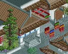
Uh oh, I remember this park! Can't believe you haven't worked on it in so long.. I'm liking the screen.
I think the buildings shape is very good, but some of the coloring and textures are to much.
Yeah, Stoksy, I agree with you. I originally intended to make this a more generic shop building, perhaps with giant dynamite sticks, anvils, mousetraps etc. so that it would be more blendable with other buildings, but I couldn't get that right and changed the design to this (based on snippets of the duo's house from the cartoons). However, the other buildings along this aisle are also disjointed, and I was kind of hoping that that would work as a style (as though clearly moving from one cartoon to the next), with the large turquoise building behind acting as a backdrop and separating them from the rest of the park. I definitely get what you're saying though, and still feel that this is a bit clunky. Might be able to come back to it later. Thanks for the useful input.
AndJJayMForce, yeah, I hit some real blocks with this park, resulting in clearing complete areas away because they weren't giving off the feel I'd hoped. In all honesty, I'm wondering how successful I can be in using a cartoonish game to replicate cartoons, if you get what I mean. I'll keep trying, but I get the feeling that the end result will be different from my intentions. But still, thanks for the comment
In regards to the colours and textures, Austin55, I'll take some out. As said, I was trying to stay true to the reference material, but looking at it, the peach corner supports under the awning aren't necessary. Cheers!
I think just making the green roof match the rest of the normal roofing would make it a whole lot less chaotic looking. Maybe try white for the walls on the second story, instead of the gray? Regardless, very cool.