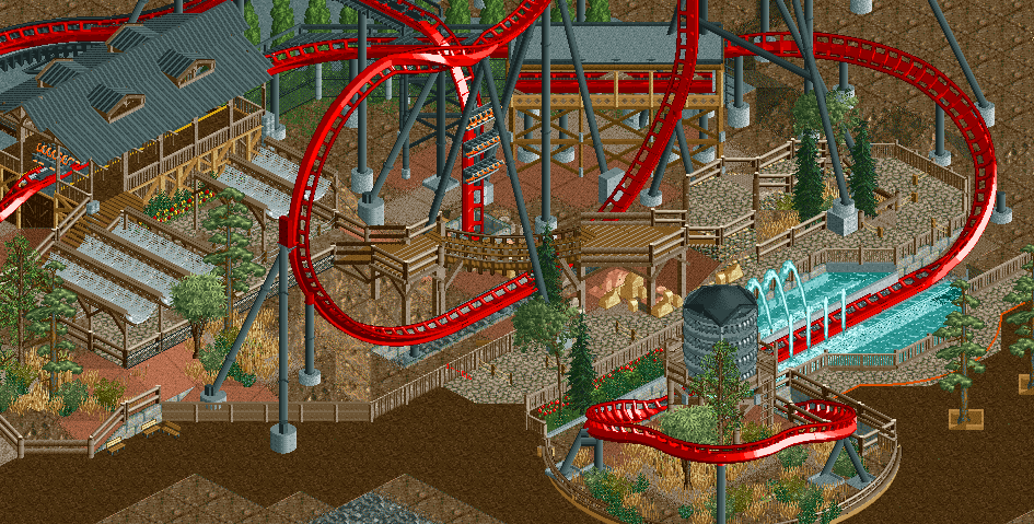
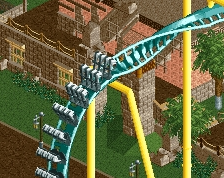
Guests in the queue have the knowledge that this is a wet ride before they get in line, and should be planning to get wet already, but guests outside the ride may not be planning to get wet, so they get a splash zone marker, to ensure their safety from dangerous splashes. Then again, riders generally don't get too wet from splashdowns, so my logic there is pretty bullshit, but that's pretty much what I was thinking.
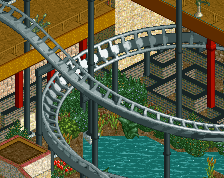
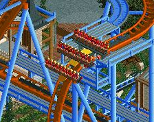
Beautiful. Only weak point for me is the helix around the water tower. That sharp turn looks awkward.
It's just the angle. It's actually higher than it looks because of landscaping height changes.
I don't like the idea of peeps in the queue getting wet either. Solid work anyway, very good looking Dive Machine
I hadn't actually thought of this before but it's a good point. I'm not really sure how you would fix it though, and it looks so nice and clean now that I would hesitate to suggest any changes.
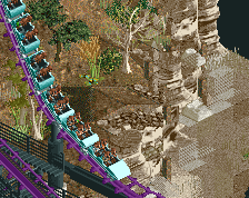
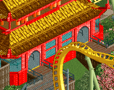
Am I the only one who thinks this is a bit sloppy? The bridge looks very forced (lower the loop one unit and the bridge with it), the fences are all over the place, creators seemingly couldn't decide between sticking to the RCT grid or taking the curves approach, and perspective ruins the brake section. It's by no means bad (voted 65%), but it's not up to par for both of you. Isn't this old, by the way? I vaguely remember this from like a year ago.
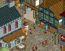
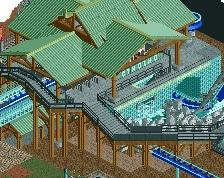
I really like the way the coaster surrounds the queue, so that the peeps waiting are constantly immersed in it. However, there's a couple of bits that stick out to me, and look a bit off. The corner bench on the diagonal path (bottom left) looks odd, and I'm not too keen on the way the trees on the right don't stand entirely central in their planters - I think these can be developed a bit more anyway as I think they are rather minimal. I'd also suggest a large custom sign be placed to cover the invisible scrolling sign. A coaster this big deserves an impressive entrance.
 07-February 15
RMM Offline
that is gorgeous. great composition.
I‘m not saying it's negative..it looks good. maybe because they are of the same color.
I do have to question why the splash zone only caters to one side of the path. Wouldn't guests in the queue get soaked?
Guests in the queue have the knowledge that this is a wet ride before they get in line, and should be planning to get wet already, but guests outside the ride may not be planning to get wet, so they get a splash zone marker, to ensure their safety from dangerous splashes. Then again, riders generally don't get too wet from splashdowns, so my logic there is pretty bullshit, but that's pretty much what I was thinking.
Well I think it looks fucking terrible. It's probably Louis' fault, I mean...that was your first mistake. #losethelou
wow this is solid. love the queue bridge across the track.
Nin, it was also partly my fault. I kinda said, put the queue like this, and tim did so
Beautiful. Only weak point for me is the helix around the water tower. That sharp turn looks awkward.
I don't like the idea of peeps in the queue getting wet either. Solid work anyway, very good looking Dive Machine
It's just the angle. It's actually higher than it looks because of landscaping height changes.
I hadn't actually thought of this before but it's a good point. I'm not really sure how you would fix it though, and it looks so nice and clean now that I would hesitate to suggest any changes.
I do Louis, but that hashtag was too good to pass up.
#hashtag
I really like the way the coaster surrounds the queue, so that the peeps waiting are constantly immersed in it. However, there's a couple of bits that stick out to me, and look a bit off. The corner bench on the diagonal path (bottom left) looks odd, and I'm not too keen on the way the trees on the right don't stand entirely central in their planters - I think these can be developed a bit more anyway as I think they are rather minimal. I'd also suggest a large custom sign be placed to cover the invisible scrolling sign. A coaster this big deserves an impressive entrance.