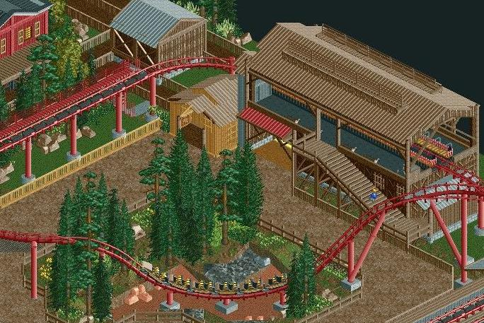
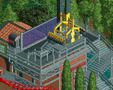
Path is a bit lifeless, and there's nothing really drawing guests towards the ride here. I think a bit of signage, and some path decorations as well as benches and lamps would fix all that.
Don't get me wrong, I still think this is a great screen, I'm just pointing out where I think there's room for improvement.
Something I think could really help is making the center portion less square in the back, bringing it in to follow the coaster a bit further. This could then open up some space for secondary planters closer to the entrance for overhanging trees.
I tend to agree that the central area is a little square. I think that you've forced that central section a little much. I would recommend getting rid of the path closest to the viewer from this angle [opposite the station] so the foliage and drop are connected more naturally to the landscape. I can't remember off the top off my head if you have another ride/building on that opposite side by if not then the path going to the right is a little redundant in my opinion. Might also be an idea to use a little less of the dirt path.
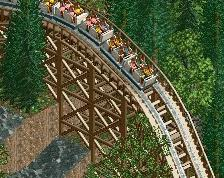
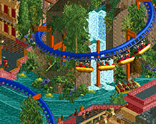
Still wonderful to see screens from this park, and I know that the coaster itself [and the interaction with the splash boats] is really great.
Agreed with Robbo, on this one. Also this just overall seems kinda dead to me. Maybe it's the brown dominating the station? Can't put my finger on it. Well, I could put my finger on the screen, obviously, but I tried that and it didn't amount to much unfortunately. I dunno man, just fix it, make it look good, fuck.
After looking at this for awhile I think it could benefit a lot from having paths that broke the grid a little. Just some slight juts left and right (not random juts but juts that look like they belong) could break the grid and really take this to the next level (especially along the brake run and station building).
I do really like the ride area though as you know and actually feel that it looks much better in game than it does in this screen. And it's still not a bad screen by any stretch.
Thanks for all the suggestions guys, made some improvements already (added awnings along light brown fence, made the central area less square in the back, added a small planter in path to break it up) and more should come, all of this is very much work in progress and will no doubt get better as I work on this more.
 08-February 15
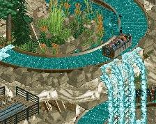

Path is a bit lifeless, and there's nothing really drawing guests towards the ride here. I think a bit of signage, and some path decorations as well as benches and lamps would fix all that.
Don't get me wrong, I still think this is a great screen, I'm just pointing out where I think there's room for improvement.
Something I think could really help is making the center portion less square in the back, bringing it in to follow the coaster a bit further. This could then open up some space for secondary planters closer to the entrance for overhanging trees.
I tend to agree that the central area is a little square. I think that you've forced that central section a little much. I would recommend getting rid of the path closest to the viewer from this angle [opposite the station] so the foliage and drop are connected more naturally to the landscape. I can't remember off the top off my head if you have another ride/building on that opposite side by if not then the path going to the right is a little redundant in my opinion. Might also be an idea to use a little less of the dirt path.
Still wonderful to see screens from this park, and I know that the coaster itself [and the interaction with the splash boats] is really great.
Agreed with Robbo, on this one. Also this just overall seems kinda dead to me. Maybe it's the brown dominating the station? Can't put my finger on it. Well, I could put my finger on the screen, obviously, but I tried that and it didn't amount to much unfortunately. I dunno man, just fix it, make it look good, fuck.
After looking at this for awhile I think it could benefit a lot from having paths that broke the grid a little. Just some slight juts left and right (not random juts but juts that look like they belong) could break the grid and really take this to the next level (especially along the brake run and station building).
I do really like the ride area though as you know and actually feel that it looks much better in game than it does in this screen. And it's still not a bad screen by any stretch.
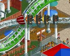
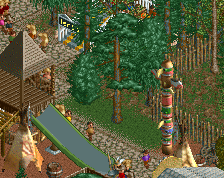
lovely stuff, looking forward to more
I do enjoy this screen. Nice and clean.
Thanks for all the suggestions guys, made some improvements already (added awnings along light brown fence, made the central area less square in the back, added a small planter in path to break it up) and more should come, all of this is very much work in progress and will no doubt get better as I work on this more.
Thank you for your support!
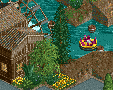
Too Kentucky not enough Tennessee 0/10
RMM Offline