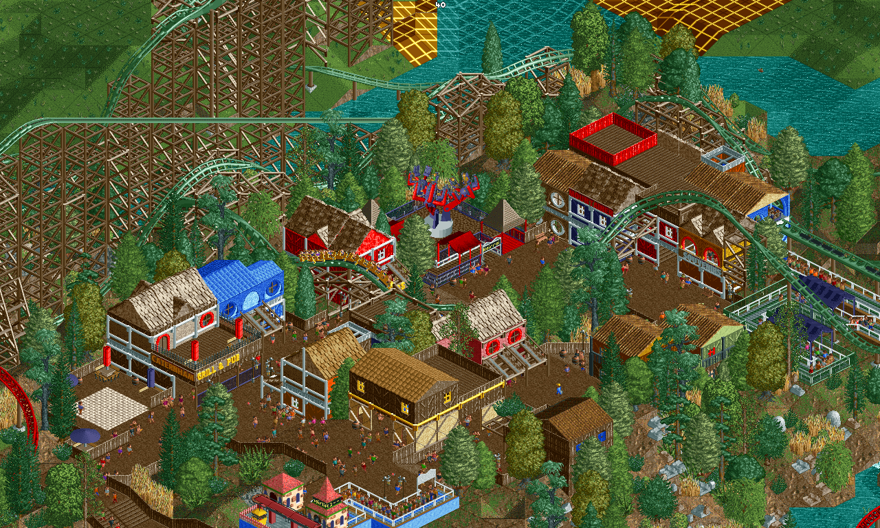
Screenshot / Redlynch Heights - Mountaineer
-
 09-January 18
-
Redlynch Heights
-
6 of 12
- Views 1,800
- Fans 0
- Comments 8
Community Forum Software by IP.Board
](https://www.nedesigns.com/uploads/screens/7074/7074_thumb.png)
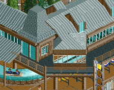
Probably some of your best work, it's nice to see your progression over the past 6 months or so.
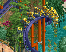
Excellent path interaction. I'm enjoying nearly all of the colors, but the blue building to the left side of the screen is a little jarring with that unicolored scheme. Add some more of the subtle brown or add more blue elsewhere to balance it out. Otherwise very nice!
You're evolving a lot as a player; I'd still like to see you get away from brown a little more, but your improvement is apparent.
I agree with disneylandian. The blue building detracts from what is otherwise a very charming screen. Great ride interaction without looking forced
The blue building would look better with a grey or brown roof. The walls seem fine because there's blue elsewhere on the screen, but placing a blue roof on top of them concentrates the blue too heavily.
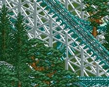
Everything else looks nice, particularly the interaction between the coaster and the path.
It's very lively and charming. I think you can improve it by narrowing down the colour palette, simplifying the textures, and combining some of these buildings together, for example the blue building could just become a 1 storey section of the grill next to it (by making the textures/colours/trims/roof the same, using the correct scale etc). So less buildings but bigger, more "compound" buildings I guess.
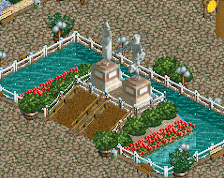
Very charming indeed, but it's hard to understand the theme. I totally agree with Alex overall.