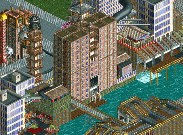
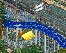
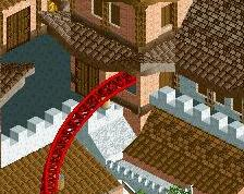
I can see where G Force is coming from. I'm certainly getting the dirty punk part, but not so much of the cyber part. I think more inclusion of some neon lights (or representations of them) and generally a lot more cables, wires, electronics etc will sell the theme a bit more. That being said, I like what's here. It's certainly got that gritty, grungy feel to it, and the mix of objects is working well to create the chaos it needs.
It's a good start but it needs some more life. Just because it's dystopian doesn't mean it should be dead.
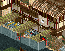
Also keep in mind that you have more tools than just large scenery pieces; you can use ride huts, station platforms, and path blocks to create even more variety in your architecture. Don't be afraid to get creative.
It's good. I like little things like the decision to color the wooden track awning different colors, it almost sells that neon cyber feel.
It's just disjointed, it's tough to pull the individual structures together but I think that's what you need to work on here. It's a solid effort so far. Just keep working at it, the pieces are there. Don't be afraid to rearrange things to get it to fit together better.
 30-January 18
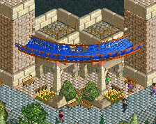
![screen_2651_katakiuchi [B&M,2015] Entrance/Plaza](https://www.nedesigns.com/uploads/screens/2651/2651_thumb.png)
It feels like it's missing a little something to me that would push it to the next level, but I can't quite put my finger on what.
i see what you mean and i appreciate the feedback. ill keep playing with this idea to see if i can figure out what this needs to make it work.
I can see where G Force is coming from. I'm certainly getting the dirty punk part, but not so much of the cyber part. I think more inclusion of some neon lights (or representations of them) and generally a lot more cables, wires, electronics etc will sell the theme a bit more. That being said, I like what's here. It's certainly got that gritty, grungy feel to it, and the mix of objects is working well to create the chaos it needs.
For me, this looks like Julow's entry on the TP Survivor Contest, but translated to LL. It's good although a little non-eyecatchy.
It's a good start but it needs some more life. Just because it's dystopian doesn't mean it should be dead.
Also keep in mind that you have more tools than just large scenery pieces; you can use ride huts, station platforms, and path blocks to create even more variety in your architecture. Don't be afraid to get creative.
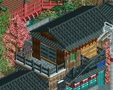
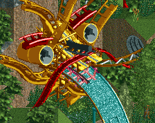
Damn. This is LL with style.
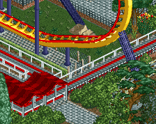
The big H building is a nice development
I'll agree that it needs a bit more cyberpunk to really nail the theme you're going for.
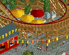
Still nice, however. Not a bad start.
It's good. I like little things like the decision to color the wooden track awning different colors, it almost sells that neon cyber feel.
It's just disjointed, it's tough to pull the individual structures together but I think that's what you need to work on here. It's a solid effort so far. Just keep working at it, the pieces are there. Don't be afraid to rearrange things to get it to fit together better.
I really like the H building. It would be a cool aspect if it was a 'h'ospital.
I would perhaps add a touch of colour. I do like this, but it feels dark and dreary. I suppose that is the theme though.
Keep it up, Merz! Big thumbs up from me!