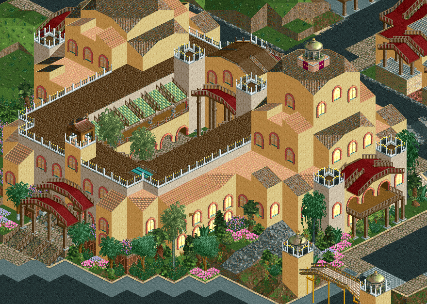
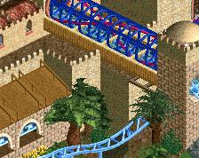
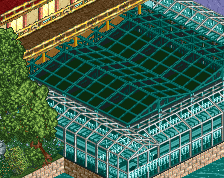
Screenshot / Vermillion Resorts: Hillside Guest Rooms
-
 31-October 19
-
The Vermillion Resort
-
34 of 36
- Views 1,874
- Fans 3
- Comments 11
Community Forum Software by IP.Board
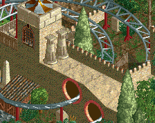
I really like this a lot, it's simple and nice. Is stuff like the gravestone columns really worth the effort though?
A building that's nice to look at on the sides and ugly on top - just like real life.
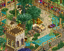
it becomes a little hard to read with the peach roof and yellow walls, though, theres not enough distinction between them. i also feel like maybe you need to simplify the forms a little. keep up the great work
Man I love this. I wouldn't change anything.
i think the columns are a nice little detail but might be better with grave monuments unless those clip through the roof
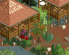
yeah this is great here
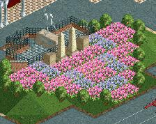
i agree- the gardens look good, and I like the little arch over the path. simpler and more well composed.
It's really nice but ruined a bit for me by the unfinished (?) corners - especially because the building itself is made in quite a minimal style (forgoing the usual fence trims, path rooves etc).
To make the simple land/roof combo of the building look more intentional, I think you need to make sure there is no unintentional bare land around it.. does that make sense?
I'm looking at this and realizing maybe ornamental foliage is the ticket. The jungle stuff is too chaotic against a minimal building texture and a nice row of stevetrees or something would set it off better.
It would probably help, but the problem I see is more the bare landscape around the building rather than the foliage.
For instance, compare the grass hill in the top of the screen to the yellow tower: both are bare land and walls and somehow ought to be distinguished, either by adding trims and stuff to the building or by adding foliage to the hill. I like the boldness of having no trims on the building, so I would opt for making sure the landscape around it isn't bare.
Then again, if it's just unfinished this is kind of a moot point.