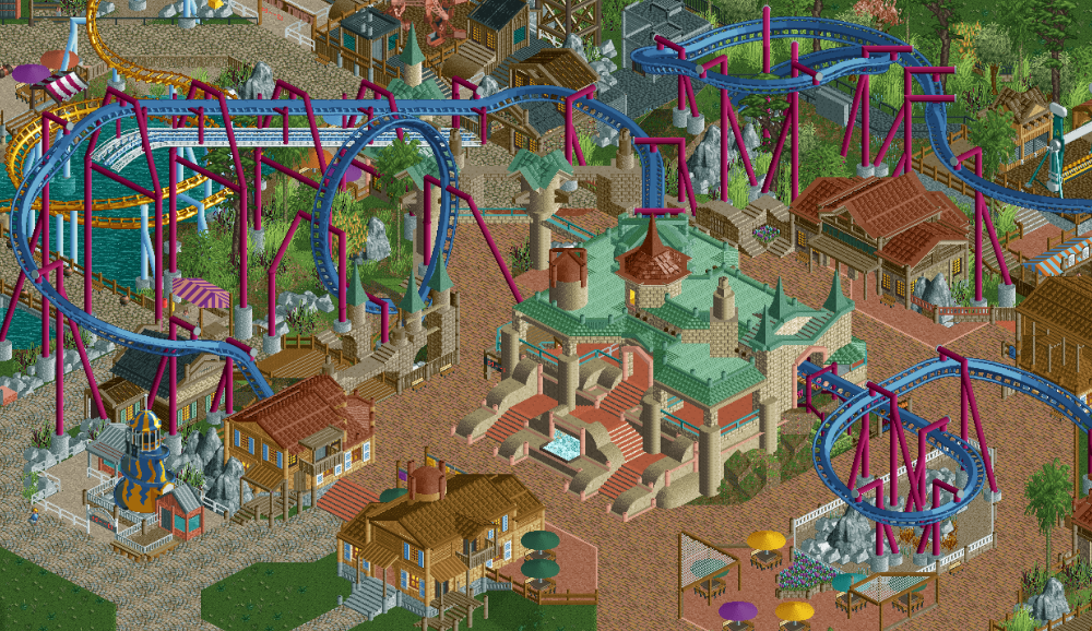
Screenshot / I feel like I'm on this game too much
-
 09-December 19
-
Walley's World
-
2 of 5
- Views 1,415
- Fans 0
- Comments 12
Community Forum Software by IP.Board
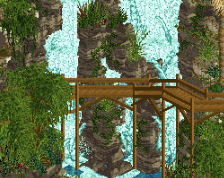
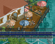
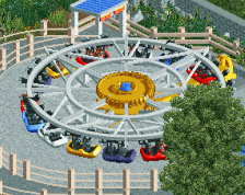
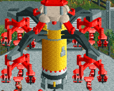
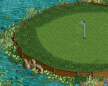
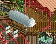
Another view
Attached Thumbnails
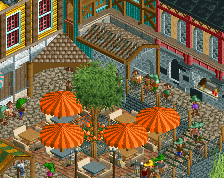
Awesome interaction, and I love how there are multiple levels to this.
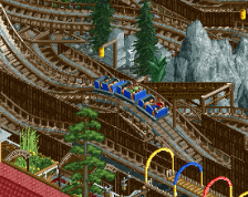
Don't get me wrong; I like this. Something feels off. I can't quite put my finger on it, but I'm not sure this area came together as well as the others in this park. There's a lot of fence types floating around and several architectural styles in the same area. Maybe it's just me; I'm not quite sure.
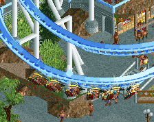
a enjoyed the interaction of the invert with the rest of the surroundings, but the layout doesn't really flow well imo. It feels like after that first helix it just meanders back to the station instead of keeping the strong pace going. everything else individually is really good though. Keep up this building pace, we need more of it in this community.
if I added a cobra roll maybe going under a pathway to replace the corkscrew do you think that would help?
Yes
How about this
Attached Thumbnails
I personally thought it was fine before, the cobra roll position looks really forced and seems like it would be pretty slow going through it. Also think you'd normally want that element earlier in a layout and have more path interaction with it.
What about having the cobra roll connect the opposite way, like below:
?
I like the screens in general - but I also agree on that there's just something that seems to be lacking. It is a little hard to put my finger on it, but here are some things that come to mind:
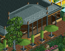
The station looks a bit odd - both in and of itself with the kind of bulky stairway in front paired with the plain deco blocks, and with what I assume is supposed to be a copper roof, but also in the setting it's in, where it sticks out a lot. Perhaps a building that more closely resembles the surrounding buildings - which all look great, by the way - would look better. Even if it might feel a bit boring to make it in a more similar style, it's the first thing that I'd take a look at.
I think the area could benefit from some trees inside it, rather than just flanking it. Not really convinced by the patch of land block on the right side of the station building - perhaps that would be a good spot to throw in a tree and some underbrush.
Could use more path objects, mainly lamps and trashcans. And maybe there are other bench types that would look better than the vanilla bench, something that stands out just a bit more against the path.
Some of the "empty" feeling that this area gives off could simply be because there are no peeps. When you peep it up, it might look a lot more lively.
I realize that the screen isn't 100% finished, and there is a lot of promise there, so it will be exciting to see how it looks after you've polished it a bit further
tbh if your going to do that cobra roll, you should extend it out a bit more, do like 3-4 straight tracks so the riders can be more prepared for the cobra roll. You get better ratings on your ride too by making that little adjustment.
I think the colors are perhaps a bit 'soft'. The paths, wall textures, rooves, etc, are all very pastelly and it makes it blend a bit, sort of like a weird dream of rct. Those new brown palette colors are great, but I tend to use them for smaller details and less for large chunks of color because they are a bit washed out. I find them better for representing old metal, rusty textures, etc. which tends to manifest itself more in fine detail.