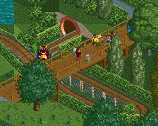
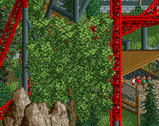
Echo the comments above, path isn't great. Architecture is simple but gets the job done, foliage looks nice, and the play area is cute. Swinging ship is kinda neat but I feel like I've seen this exact one done a few times now. Solid enough still.
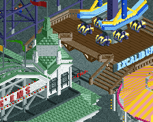
The pirate ship is good and so is the queue themeing. Odd you have such a nice custom flat and then an amazing Earl one right across from it . The wood stairs protruding out like that could all be straight imo. I don't like ruin spam as border and agree about path statements.
There's a lot of path textures that would work better than this one, but if you do like using it, I suggest some grey or black quarter-tile flat roof textures to border it with.
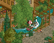
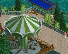
Those benches facing the water are really pretty and make the scene.
I don't personally like such a heavy grass type on top of the wooden pergolas at the top of the screen. Something less tall and less dense could be a more natural option.
I've been using this path type lately... it works much better in smaller amounts... thinner paths or flat roof tops etc. If used right, it's awesome, but overused turns it ugly.
Sorry to echo the path choice again but it's really the only hinderance I think. It would be much better suited as an accent. Maybe just along some of the buildings and path edges.
Great work though man! Still has tons of atmosphere.
i think if you broke up the path a little bit with similar texture colors like the brown crazy paving then it would break the monotony. the main issue is that the pattern is so repetetive. i wish you could rotate them or something!
Unlike G Force, i like the AE ride. It still holds up after all these years as one of the best custom flat rides, and I like how you integrated it. I'm gonna predict those sunflowers are gonna be a new trend in RCT....
The real highlight is of course the swinging ship. Man, you're always so full of good ideas, I really like the use of those bones on the queue.
 29-April 20
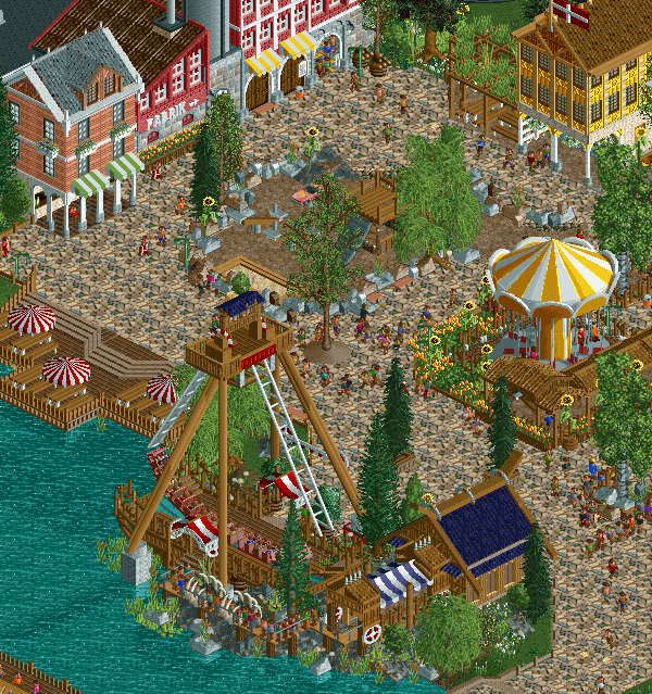

not a huge fan of that path type but the rest looks great!
The path is a bit loud and aggressive, however, and I'd recommend trying to tone it down by swapping out the type or breaking it up a bit more.
Echo the comments above, path isn't great. Architecture is simple but gets the job done, foliage looks nice, and the play area is cute. Swinging ship is kinda neat but I feel like I've seen this exact one done a few times now. Solid enough still.
Lovely
That path type makes me wanna puke.
Otherwise: nice!
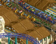
Might just be the cropping but I'd make the swinger and the building across from it different colors, having them both yellow is a bit odd.
Sorta agree with rgb tho, this amazing swinging ship is sorta ruined by the awful AE ride lol.
The path is really throwing me off, other than that it's very lovely and cute.
There's a lot of path textures that would work better than this one, but if you do like using it, I suggest some grey or black quarter-tile flat roof textures to border it with.
Those benches facing the water are really pretty and make the scene.
I don't personally like such a heavy grass type on top of the wooden pergolas at the top of the screen. Something less tall and less dense could be a more natural option.
Really lovely screen though. Classic cute Faas.
I've been using this path type lately... it works much better in smaller amounts... thinner paths or flat roof tops etc. If used right, it's awesome, but overused turns it ugly.
Love the screen though Faas, great stuff!!!
Sorry to echo the path choice again but it's really the only hinderance I think. It would be much better suited as an accent. Maybe just along some of the buildings and path edges.
Great work though man! Still has tons of atmosphere.
i think if you broke up the path a little bit with similar texture colors like the brown crazy paving then it would break the monotony. the main issue is that the pattern is so repetetive. i wish you could rotate them or something!
otherwise looks pretty dang good
first stuff from you i actually really think is good, step up from previous work from you
You made that path work, kudos!
I'm gonna refrain from commenting on the path....
Unlike G Force, i like the AE ride. It still holds up after all these years as one of the best custom flat rides, and I like how you integrated it. I'm gonna predict those sunflowers are gonna be a new trend in RCT....
The real highlight is of course the swinging ship. Man, you're always so full of good ideas, I really like the use of those bones on the queue.
Great work Faas.
I see G's point about the colours. I think one solution would be to add some yellow to the left of the screen to balance it out.