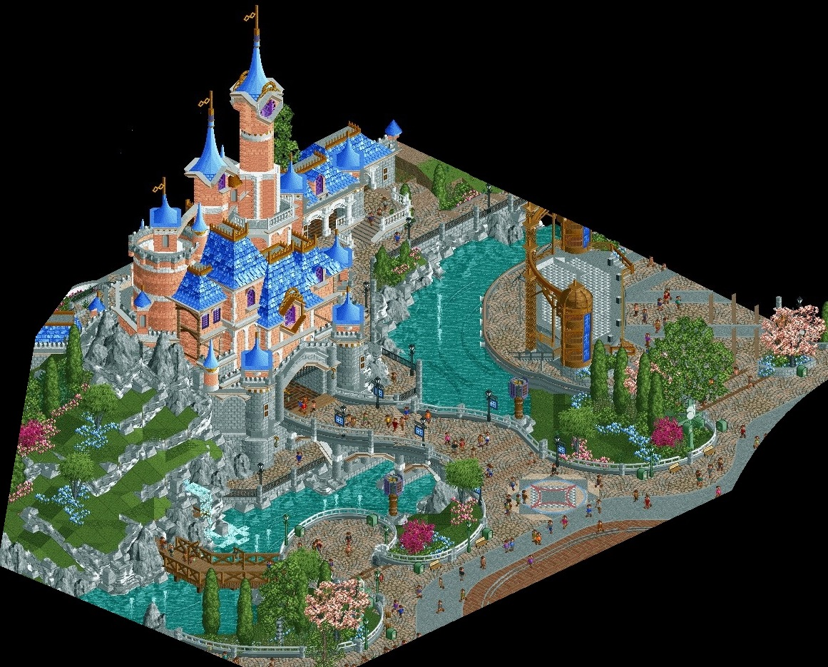
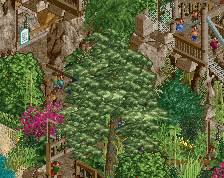
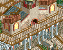
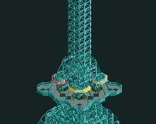
Screenshot / Le Château de la Belle au Bois Dormant
-
 11-June 20
-
Disneyland Resort Paris
-
1 of 5
- Views 15,376
- Fans 20
- Comments 38
Community Forum Software by IP.Board
Fam..
Yup, you still got it.
The castle is fantastic, really loving the foliage too. I somewhat agree with Jappy regarding the landscaping to the left, the forms are lovely but it feels overtextured.
Outstanding, A beautiful middle finger to the grid-based system.
It's incredible, so, I am going to nitpick like I do with every incredible screen that comes along:
It feels a little busy, maybe. Disney has the magic of being serene even amongst the hustle and bustle of their busiest days and I think you could achieve this. First thing that draws my eyes is the rockwork. While it's stunning, there's a lot going on texturally. I think it kind of works, but with the LOTR rocks, the BTMR rocks and 1K ruins...I can't help but think there's a slightly more graceful solution. Masterful use of the grass and overall landscaping, however.
Also, the paths are another culprit of it feeling busy I think. Again, just a lot of textures. A couple different cobblestones, the tarmac, a couple brick paths and wooden walkway...and I'll say it again: it does technically work but cleaning up path types is a sure-fire way to some extra cohesion. I think it's worth a try if you're game.
It's wonderful to see you back, Airtime. Truly excellent work despite any criticism and I can't wait to see more, dude!
Looks fantastic of course, as mentioned above. I think the castle looks great and you don't have to touch it if you don't want to. But I see everywhere you have a peak with the blue roofs, youve gone for the diagonal crown molding. I think there is a curved crown molding piece that would work perfectly there, making those peaks look more round. Minor change, just curious about it.
gee! very beautiful, nice environment
Airtime Offline
Appreciate all the comments.
What you can do in the game and all the new objects is crazy to where I left it. Really well done to everyone who’s pushed the game this far, the Open team and all the object creators etc.
Nin, as in short do you mean not tall enough? I feel it’s tall enough, I think other angles make it look taller. If anything I was worried it wasn’t wide enough but I think it’s pretty close to Paris’s castle in general shape.
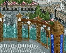
Split, I think the trash cans fit as they feel very Disney and I’m trying to make sure I get as much Disney accents as possible. Im not sure on the colour of them though as they are currently too similar to the speaker/lighting posts I’ve used. The ornate objects are IRL some sort of element used in the evening projection show I think but also add theming. The coloured bush’s have definitely been used before, I think I saw CP6 use them in a SeaWorld screen from years ago, maybe one of the first to do as he normally is.
Jene, as above I believe they’re used in the evening projection show. There meant to be themed so don’t think they’d suit being green.
Jappy, each to their own about the rocks, I toyed with a few variations and I think for what I’m trying to achieve, this is the best I could come up with.
Xtreme, as above and mentioned in the discord I’ll look if I can clean up the textures. Assuming you mean on the rocks though? I don’t want to detract anything from the grass and I actually think if anywhere that’s where there’s an issue of it looking bland.
Steve, appreciate the comments, interesting ones though I didn’t see coming. I went over and over areas in the screen making sure they felt Disney. As above I’ll look into cleaning the rock up a little but I definitely like the combo I’ve used. I don’t understand how it’s not serene? Maybe it’s the crop of the screen but if anything I was worried the paths were too open, and as you get to the hub or the stage area there’s a lot of path. I was worried they’re too plain tbh. Maybe the tarmac should be reduced or go but I didn’t like the abrupt cobble to brickwork, I’ll look into it.
Matt, are you talking about the large scenery round crown moulding? That wouldn’t work on the towers unfortunately as most are not built on the grid. If there’s a 1/4 tile object then that’d be awesome, I’ll go search as I didn’t think there was?
I think in terms of physical height it's tall enough, but the use of objects (especially in the main tower) in relation to it's proportions makes it come off as shorter and "chubby". The only real way to compensate for those proportional issues would be to make it taller, but I can see why you may be against that.
Really cool screen, I like all the forms and shapes and breaking of the grid. Maybe too much gray.
I will never understand why people do these awful MS paint crops - it takes so much away from the screen. As much as I don't like unfinished screens, I'd rather see blank grass than this type of crop.
^I would say this one is actually a quite sophisticated crop since the castle towers reach out above what I presume is a custom made black background. I like this.
i cant help but to feel that this falls in some of the same traps as stoksy's work
where it's really well-made, and it's clear the focus is put on how much effort it is, but in a way by doing that it's hard to read.
there's not enough negative space to balance it all out- this is a park weenie, right? the textures and details are given more love than the form is to really make the castle imposing and eye-drawing.
the one thing i obviously absolutely love is the curved bridge. it's the one thing in the screen that gets it all right- the hierarchy of form being accentuated by detail rather than the other way around
in a lot of ways, this is a step back from your more postured work. it's less readable and my eyes are being dragged to places that seemed unintentional. it's more virtuous and screenshot-bait, so of course the fawning over is going to be expected, and i do *like* it, but it loses the subtlety and focus that your other work bleeds with
It's a bit of a textural overload for me which makes it harder to read. The individual components are all really great, enough so that the castle itself may actually be my least favourite thing in the screen; I wonder if maybe going for a flatter, more matte texture for the bulk of the building rather than using the brick for the whole thing would make it easier to read and would make the actual forms shine more. Maybe flattening the texture of the walls themselves and making the more texturally-complex bits be limited to more intricate trims could keep up the detail level while not feeling quite as messy; it could push the castle to feeling as complexly-detailed as the stage towers, for instance.
This is so beautiful- which objects did you use to get the curved paths?- I may need them as one of vanilla's problems is it's so,erm, square- which is not so real life- this shows just how much difference breaking out of the straight lines and grids 'squareness' can make. I really need to get better at architecture too- way behind most of you!
I am in awe. This is fucking gorgeous!
looks like a lamp
Gonna go with visually integrated surround speakers, for all the parades