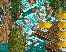
Not sure why the screenshot is blurry but wow this looks fantastic. Love the curves
G's opening line with his Tinder matches
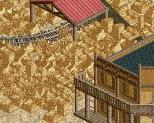
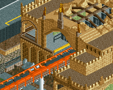
yellow coaster at entrance, parking lot, trees in a row, brown mulch with foliage. shameless SWB ripoff. I'd rate this at a low spotlight instead of mid.
Great screen! Nice details, shapes and color choices. Not sure about the big grey building among the other entrance buildings though, and the bright grey path inside the park, combined they kind of distract me from how warm and cozy the rest of the screen is. If I look at the screen and imagine the grey building isn't there at all, and that the spot instead is filled with trees, the entrance still looks good and complete to me. And I'd be curious to see how it would look with a path outside of the grey scale for the area immediately upon entering the park. Neat stuff at any rate!
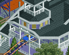
Great screen! The scene with the little mine train and the park sign is lovely. The mini-cathwalks seem to be floating though. I would give them some supports
I'm not a fan of the light grey path inside the park, it's a little weird it would just be brighter for some reason. And I find the orientation of the entrance itself sorta odd, facing a coaster but when you approach it as a visitor you can only see the side. But on the other hand I can appreciate it because this is one of those weird situations you can probably defend as being strangely realistic as well.
The rest is stellar. The little display with the train, the archy... Great work! Unlike nin, I still like this generic style. It's similar to G Force's, but it feels warmer.
I like the entrance setup quite a lot, cool unique layout. Style wise I'm not impressed with the path mixes. Mixing light and dark grey, and using the mulch object as path as well as mulch, side by side, is not working. The foliage is also completely opposite to my personal preferences. Some big issues but it's still a great screen. Love the entrance, love the coaster!
 21-June 20
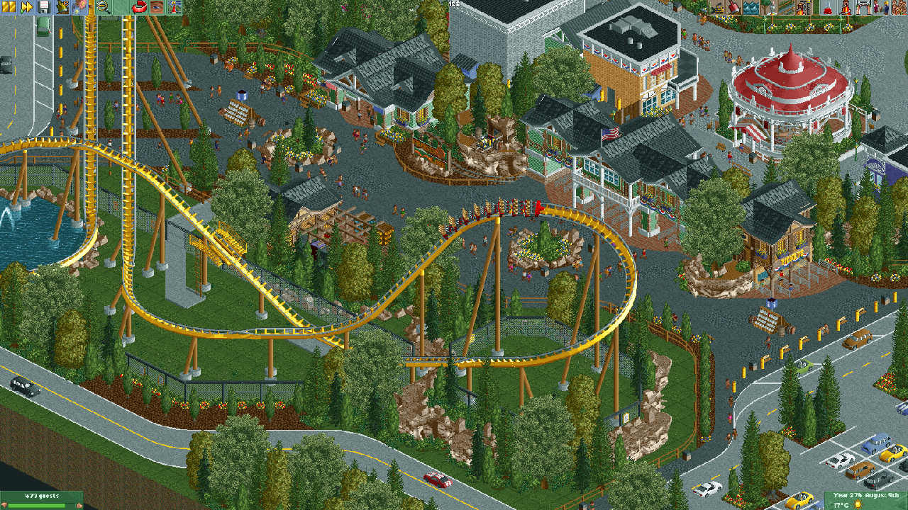
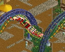
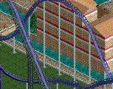
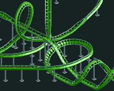
Yea not sure what happened, here is a clear version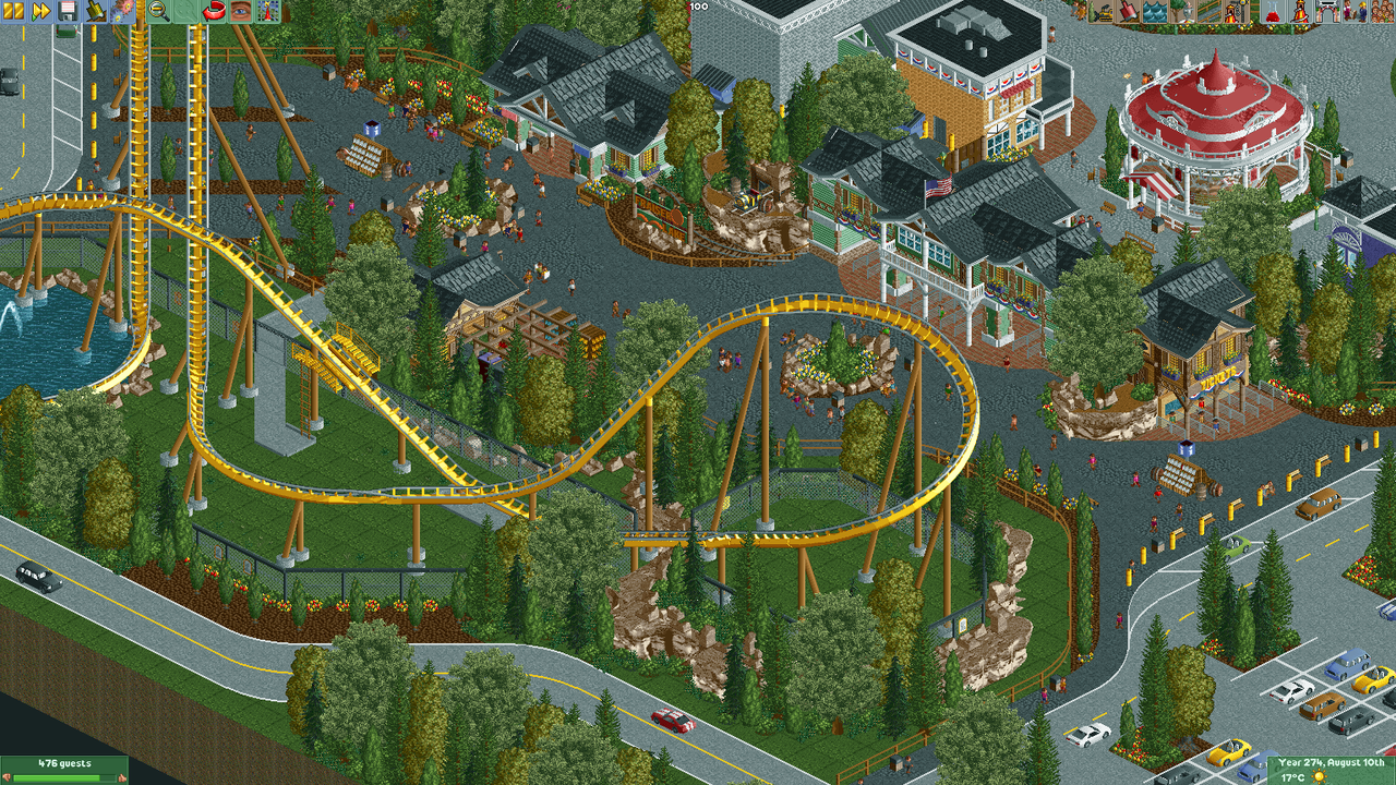
Excellent screen. Love the composition and in particular the way the entrance is approached from two sides.
G's opening line with his Tinder matches
yellow coaster at entrance, parking lot, trees in a row, brown mulch with foliage. shameless SWB ripoff. I'd rate this at a low spotlight instead of mid.
Superb screen, the way the coaster interacts with both sides of the entrance is excellent. The entrance sign and rockwork are gorgeous as well.
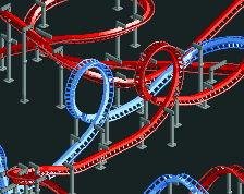
wow
Looking fantastic!
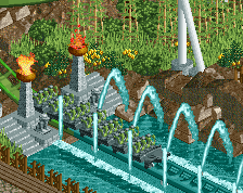
that is a sweet entry plaza. feels so natural but i cant actually think of a park that does it like that. very good
Amazing entrance.. love the little train detail
Oh boy, I really like this so much! Thanks for sharing!
Great screen! Nice details, shapes and color choices. Not sure about the big grey building among the other entrance buildings though, and the bright grey path inside the park, combined they kind of distract me from how warm and cozy the rest of the screen is. If I look at the screen and imagine the grey building isn't there at all, and that the spot instead is filled with trees, the entrance still looks good and complete to me. And I'd be curious to see how it would look with a path outside of the grey scale for the area immediately upon entering the park. Neat stuff at any rate!
Great screen! The scene with the little mine train and the park sign is lovely. The mini-cathwalks seem to be floating though. I would give them some supports
this is wonderful!
I'm a bit burnt out on this traditional amusement park style, but this is fantastic. Big fan.
I'm not a fan of the light grey path inside the park, it's a little weird it would just be brighter for some reason. And I find the orientation of the entrance itself sorta odd, facing a coaster but when you approach it as a visitor you can only see the side. But on the other hand I can appreciate it because this is one of those weird situations you can probably defend as being strangely realistic as well.
The rest is stellar. The little display with the train, the archy... Great work! Unlike nin, I still like this generic style. It's similar to G Force's, but it feels warmer.
Too much grey (path) imo, other than that it's great.
I like the entrance setup quite a lot, cool unique layout. Style wise I'm not impressed with the path mixes. Mixing light and dark grey, and using the mulch object as path as well as mulch, side by side, is not working. The foliage is also completely opposite to my personal preferences. Some big issues but it's still a great screen. Love the entrance, love the coaster!