Screenshot / Bootje varen
-
 13-July 20
- Views 1,111
- Fans 1
- Comments 8
-
Description
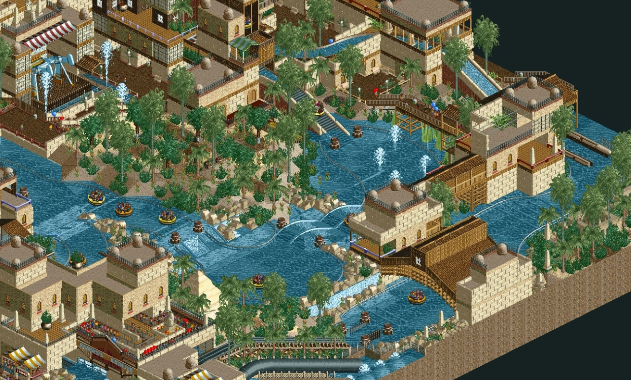
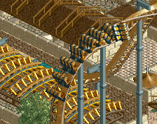
A mini map I made with some small rides and a rapids. Messy park with lots of faults and glitches but that is to expected for a first try of layering tracks... This technique was used to get the rafts a random parcour which worked out pretty well.
Not uploading it though, because of the mentioned glitchiness... -
Full-Size
-
1 fan Fans of this screenshot
-
Tags
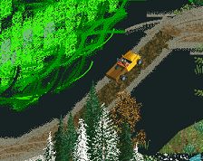
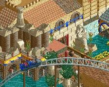
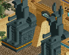
I really like the old school feel here. The screen is a bit let down by the paths being obscured, instead of using them as a feature and element in your composition. Foliage mix works, it feels arid despite the high density. However I think it would still be better if you varied the density, have some open space as well as a few denser areas. Again, this adds more dimensions to your composition and you can highlight certain areas/details in your park as well as draw attention away from uglier bits.
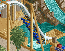
I think this is a case where the standard water color would look better. I generally like what you have here though - maybe a few splashes of bright color (like red/yellow banners or something) would add to it.
What do you mean by giving the rafts "a random parcour"? Are you indicating they have the look of bouncing around and actually flowing on the river instead of just following one tracked path?
Cause, if not, then woah idea for realism, design a handful of paths for your rapids and have boats on each to give it the randomness associated with a floating object...
nice bootje, but not thic enough
I felt that the natural water looked to tropical. I wanted this egyptian theme, with a Nile feel, be a bit "dirtier". But I get the need for more color though...
That's exactly it.. It's two rapids stacked on each other so some boats take a wide turn, some the tight turn. If the timing is right, they even overtake... so it feels more natural... If you want to take a closer look I can send you the save through PM.. But they glitch a lot and the two tracks go though eachother quite a bit...
All the others, Thanks for the feedback! I will definitly take it with me on the next project!
Gotcha, definitely a really cool concept to try to add that sense of realism into a rapids ride. I'm not a very knowledgeable hacker, so i'm not sure if there is anything to be done about overlap or duplicating tracks through a single station. But, if you made a full rapids ride with maybe 2-4 different tracks through the ride and tried to time them out, cool look really cool. Unfortunately, I can't think of any way to get that bouncing-off-each-other realness of the rides in real life.
Pretty cool scale here, the waterfalls/rapids and lift area are especially neat. The foliage is a bit sporadic and messy, Id suggest clumping up the trees and shrubs more rather than randomly dispersing them. Looking at areas of foliage as shape and form rather than individual plants will take you much further.
I also agree with the color mentions above- the default water color would likely work in your favor, as well as an accent color appearing somewhere for additional contrast. Maybe even textured rooftops?