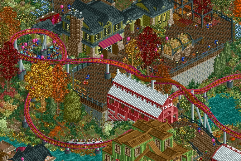
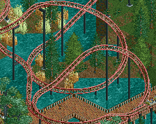
I like this much better than your last screen. The last was bustling and colorful but this one has a much more convincing atmosphere for me and feels more like a real place.
Love it, yet another awesome screen FK. Some thicc autumn atmosphere going on there. Ride interaction, archy, color choices, and foliage are all on point. This seasons project is something I seriously am looking forward to seeing in-game, the screens you've shown so far are all fantastic (though I'm inclined to agree with Ge-Ride that this one is one notch above the summer screen, which was still great).
Only things I can think of in terms of suggestions would be to try to add some variation:
- to the red building along its length somehow
- to the stone wall foundations which are exposed and take up a pretty large space in the screen. Maybe slap some more vines on there, or somehow add in some other subtle variation in the texture if possible. Maybe simply use the TI to slant a piece or two (and cover up any eventual resulting holes with another stone wall piece).
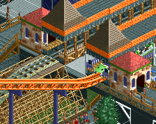
The bridge building is stand out for me. The whole screen is so crisp it feels like you're playing a different game.
Personally I like how bare the stone walls are because everything else feels quite intense on the eye. By far the best use of orange grass I've ever seen. Colours remind me of Jappy's Everland but seem even more intense here, you're really doing a great job at pulling off the seasons.
Great shit. Just missing one element: fungi. Fungi on the ground. Fungi on the walls. Fungi on trees. Fungi on the bread that I bought only yesterday wtf
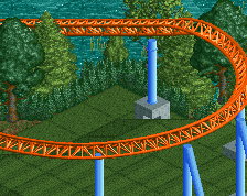
I think the autumn feeling would sell better if the coaster wasn't the same colors as the trees. I think it takes away from the novelty of the orange and red trees. I really like the details of the fallen leaves but I think the colors are jumbled/running together since every tone is earthy.
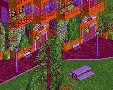
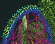
Really gorgeous and atmospheric. I actually love the coaster colours, apart from maybe the grey supports. My biggest issue with this screen is the red/white building, I've never liked that colour combo unfortunately, but that might just be me. The buildings up top are superb.
Ge-Ride - I'm glad you like the Autumn atmosphere. All the areas of the park are intended to provide a sort of collage of that season. With Autumn being a trickier and less common theme, it has a more traditional and almost realistic approach than the other areas.
Splitvision - The red building is actually a covered bridge. I'll take a look at it and consider some potential changes to clean it up and maybe add some variation to the roofline. For the wall, I do agree with salsaontop that it provides a bit of organization and neutral space given the intense-ness of the landscaping.
Liam - I do have mushrooms in the area, but oddly not in this screen. I'm planning to refine some of the landscaping here so i'll definitely incorporate more, particularly where there are piles of leaves.
RWE - I agree, there is a bit much 1k bush on that hill. I'm planning to review and refine some of the landscaping in this area including that hill, which was one of the first things I built in the park.
csw - I have actually tried a lot of different colors for the coaster, and I went back in and took another look based on your comment. You'd be surprised how quickly this area loses the Autumn atmosphere when you change it to another color, particularly because the coaster is a very dominant element of the theme. I'll keep playing with it to see if anything else sticks.
Xtreme97 - The red building is a covered bridge, thus the shape and styling. I'm planning to give it another look over to clean up some edges, but I do like the red and white for this theme.
Thanks again for the feedback; i'm taking everything into careful consideration because I want this park to be the best it can be.
 01-August 20
yeeeaaaaah boy thats awesome
I like this much better than your last screen. The last was bustling and colorful but this one has a much more convincing atmosphere for me and feels more like a real place.
Love it, yet another awesome screen FK. Some thicc autumn atmosphere going on there. Ride interaction, archy, color choices, and foliage are all on point. This seasons project is something I seriously am looking forward to seeing in-game, the screens you've shown so far are all fantastic (though I'm inclined to agree with Ge-Ride that this one is one notch above the summer screen, which was still great).
Only things I can think of in terms of suggestions would be to try to add some variation:
- to the red building along its length somehow
- to the stone wall foundations which are exposed and take up a pretty large space in the screen. Maybe slap some more vines on there, or somehow add in some other subtle variation in the texture if possible. Maybe simply use the TI to slant a piece or two (and cover up any eventual resulting holes with another stone wall piece).
F**kin' favourite season!
The bridge building is stand out for me. The whole screen is so crisp it feels like you're playing a different game.
Personally I like how bare the stone walls are because everything else feels quite intense on the eye. By far the best use of orange grass I've ever seen. Colours remind me of Jappy's Everland but seem even more intense here, you're really doing a great job at pulling off the seasons.
Great shit. Just missing one element: fungi. Fungi on the ground. Fungi on the walls. Fungi on trees. Fungi on the bread that I bought only yesterday wtf
simply amazing
your detailing is really great
Awesome, only thing i might change is the amount of 1k half bush, a bit too much in my opinion
I think the autumn feeling would sell better if the coaster wasn't the same colors as the trees. I think it takes away from the novelty of the orange and red trees. I really like the details of the fallen leaves but I think the colors are jumbled/running together since every tone is earthy.
Really gorgeous and atmospheric. I actually love the coaster colours, apart from maybe the grey supports. My biggest issue with this screen is the red/white building, I've never liked that colour combo unfortunately, but that might just be me. The buildings up top are superb.
So good
Thanks for the feedback everyone!
Ge-Ride - I'm glad you like the Autumn atmosphere. All the areas of the park are intended to provide a sort of collage of that season. With Autumn being a trickier and less common theme, it has a more traditional and almost realistic approach than the other areas.
Splitvision - The red building is actually a covered bridge. I'll take a look at it and consider some potential changes to clean it up and maybe add some variation to the roofline. For the wall, I do agree with salsaontop that it provides a bit of organization and neutral space given the intense-ness of the landscaping.
Liam - I do have mushrooms in the area, but oddly not in this screen. I'm planning to refine some of the landscaping here so i'll definitely incorporate more, particularly where there are piles of leaves.
RWE - I agree, there is a bit much 1k bush on that hill. I'm planning to review and refine some of the landscaping in this area including that hill, which was one of the first things I built in the park.
csw - I have actually tried a lot of different colors for the coaster, and I went back in and took another look based on your comment. You'd be surprised how quickly this area loses the Autumn atmosphere when you change it to another color, particularly because the coaster is a very dominant element of the theme. I'll keep playing with it to see if anything else sticks.
Xtreme97 - The red building is a covered bridge, thus the shape and styling. I'm planning to give it another look over to clean up some edges, but I do like the red and white for this theme.
Thanks again for the feedback; i'm taking everything into careful consideration because I want this park to be the best it can be.
Gorgeous and atmospheric, I love it! Especially the contrast between the barn and the mansion, they both fit so well. Also the foliage is top notch
OMG looks great, nice colors and details
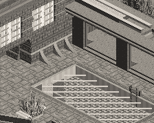
looking great, one small nitpick is that some footers seem to be tall for no reason really, I'd try and make them all one unit high for a cleaner look