Screenshot / SuperSonic
-
 30-September 14
- Views 2,371
- Fans 1
- Comments 15
-
Description
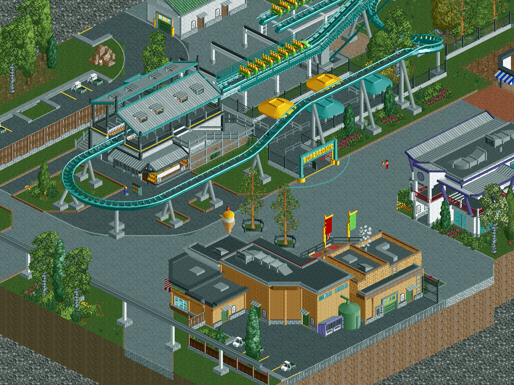
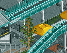
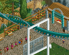
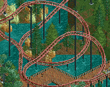
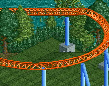
So for about six weeks now I have a new side project.I got heavily inspired by Fury 325 and built my own take on this coaster. It is set in a modern/motor themed area, though because of the size of the coaster it actually touches parts of the parking lot and entrance as well.
-
Full-Size
-
1 fan Fans of this screenshot
-
Tags
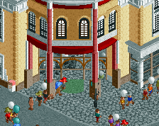
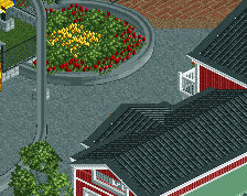
After seeing this on reddit, I'm really glad that you finally posted it here. Really great I think, there's some really top quality architecture and some cool backlot areas. If that's an ice-cream by the way, then that is awesome.
Small nitpicky thing; really not a fan of those chinese cedar tree planters. They just don't fit for me, would prefer either a different tree or the planter being connected to the ground. Additionally, having them right next to each other doesn't help because they just look out of place.
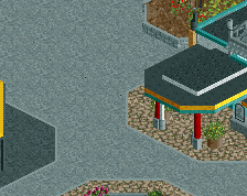
For such an impressive ride, the queue seems really short as well. It's just cramped up in between the brake run and the lift. For such an impressive coaster, I personally imagine a more sprawling and interesting queue that maybe weaves in and out a little more. I think that people should be directed towards the entrance of the coaster more than what they are now; I mean it's just placed on the edge of a path without much in the way of direction.
Still a great screen though; look forward to more screens from you!
I still love this. Really top quality work.
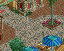
My only suggestion is to try adding in some awnings/umbrellas/coverings to break up the path and add in some extra colour.
Really awesome work. The thumbnail doesn't do this screen justice. Normally I'm not a fan of this sterile type of building, but the atmosphere is actually pretty fun!
Great work nice detail cool layout.
This just screams Cedar Fair to me. Very nice.
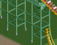
If I had to nit-pick I'd say that while the transfer track looks nice this coaster would almost definitely have 3 trains. The only B&M hyper / giga that doesn't is Goliath at SFOG but that's because it's at a Six Flags park and they don't care. I'm not including Hollywood Dream or Goliath at La Ronde because while they're the same style of ride they're much smaller.
If this coaster has 3 trains then you need a larger transfer track as B&M always allows room for all of the trains in transfer. Right now it's only set up for 2 trains. If this coaster has 2 trains I'd add a 3rd for the sake of realism.
The location of the transfer track is also odd for B&M but I believe it's consistent with Fury 325 so it works.
Overall I love this though. Great work.
Richie Offline
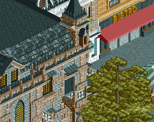
The detail even in the back parts of your buildings is amazing.
I love it
Technically it's really great! Two tips: Use round footers for the coaster because the square ones look ugly & use another type of path because now this area looks way too gray!
I'd also change the color of the supports to break the grayness.
70%
Change the footers on the coaster and monorail and you've got a tremendous screen here. Great work.
Other that that stay tuned for more stuff coming soon:)
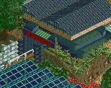
The pruple roof on the right looks awesome, love how you've supported it.
favorite recent screen so far, this is beautiful. There are a few suggestions I have though, as mentioned earlier, the queue is too short for such a massive attraction. Also, consider me a b&m nazi but the two brake runs at the end are missing their catwalks, but I've had lots of fun looking at the detail put in this.
architecture has some super nice forms going and the screen as a whole is well-composed. your path usage is killing any vibe that the screen has going for it, not only in style/color but also in how and where you break the path to induce better flow.
the way you did the pathing underneath the final break run, for example, strikes me as really odd.
70%
The awnings on the purple and white building are excellent and really give off the motor/modern feel... maybe because they emulate the audience stands. the entire shape of the bottom building is great too and the little details all over it are fantastic. As for the coaster though, while it looks technically accurate, I'm afraid it's not something I'd spend long looking at. As has been said before, perhaps some additional colour will help to break up the grey and give the entire area some more life. Still, great work!