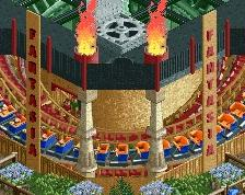
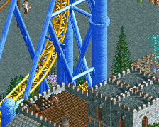
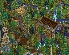
I love everything about the little turnaround, the enterprise, and its queue, but the rest of the screen is... meh. The plaza outside the haunted mansion seems out-of-place, and the elevator housing should be a little more "solid".
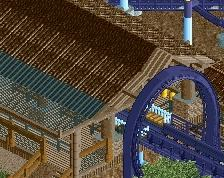
In my opinion, the rapid stairs are overkill. And i'm not sure whether that's the right place for a haunted mansion. I feel a haunted mansion should almost be isolated, hidden in a dark forest or on the top of the hill. I feel that this just doesn't belong there.
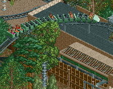
I'm also not a fan of the solar Panels (cuase they simply doesn'tlook similar to the ones we have on our Roof..) nice idea, maybe try gray, but White doesnt fit..
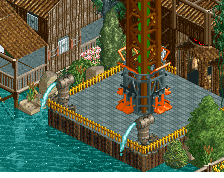
it's still a bit monotonous and sterile, try some more Color accents, Details and architecture fit each other.
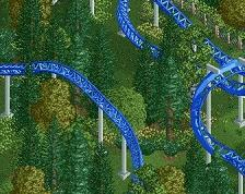
I wanted to show you that for a while now, but I have no clue why... Red one is a Dive-Machine, then a GCI Woodie and at the bottom it´s a floorless coaster...
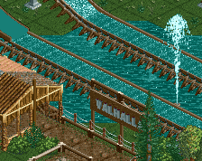
Btw: Märchenparadies is out, check that one out you lazy... thing! :P
 11-March 14
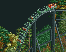
solar panels aren't very scary
(and are usually blue)
I love everything about the little turnaround, the enterprise, and its queue, but the rest of the screen is... meh. The plaza outside the haunted mansion seems out-of-place, and the elevator housing should be a little more "solid".
They cant be seen from inside so I dont give a shit if they are scary or not. And they look bad with blue
@Corcscrewy: Seems like it.
@Ling: Hm, I will have a look at it.
ich mag es wie der turn um den enterprise geht (INTERACTION) aber der Bereich vor dem Snack Restroom schaut n bissle komisch aus finde ich .
In my opinion, the rapid stairs are overkill. And i'm not sure whether that's the right place for a haunted mansion. I feel a haunted mansion should almost be isolated, hidden in a dark forest or on the top of the hill. I feel that this just doesn't belong there.
BigB Offline
I'm also not a fan of the solar Panels (cuase they simply doesn'tlook similar to the ones we have on our Roof..) nice idea, maybe try gray, but White doesnt fit..
it's still a bit monotonous and sterile, try some more Color accents, Details and architecture fit each other.