I thought i was the only one using hydrants like that . Love this, its full of your clever tricks like always. Def in my top 3 most anticipated parks to look forward to.
The diagonals and styling and architecture details, particularly on that main building, are incredible. Really exciting to see that all come together.
The only thing that I think might be lacking is some of the textures. So many of the buildings have the same smooth rct texture that makes them appear a bit flat. Based on some of the newer styles to come out of GT, I think this could benefit hugely from some grit and grime to roughen up the buildings a bit and build a bit of depth into everything. Even just mixing some finer textures or discolorations to some of the taller buildings would do wonders.
This is insanity. I don't think anybody's ever worked with this kind of huge verticality in an urban environment and had it have angles this clean, not to mention the unbelievable object use.
Thanks guys for the nice comments, really appreciate it!
Regarding some of the comments:
I plan to build this map in two stages, stage one will be setting up all the archy in place, and then stage two will be filling it up with life and crunching it up. Very probably I will reach the object limit before finalization of stage one already, which is sad but unavoidable, cause I really want to keep up the level of detail. I hope after stage two the streetlevel will be better and more convincing eventually.
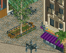
Also I want to mention that I consider lots of the buildings just fillers which have to be there to get the city feeling/immersion but which I don't consider to need to be 100% fleshed out, lots of these buildings are also copied around the map, so you can be sure to find each of these more than once somewhere. Then there are the highlights buildings which take more detailing and processing. I think this screen makes the hierachy quite clear.
 01-March 21
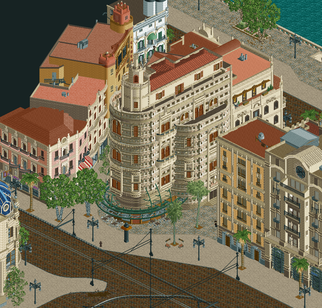
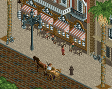
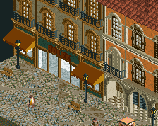
The differences between grain size across the buildings and the lack of street life are the only two downsides of this otherwise gorgeous screen.
I agree with Alex on needing more details on the peep level. Other than that this looks amazing.
The diagonals and styling and architecture details, particularly on that main building, are incredible. Really exciting to see that all come together.
The only thing that I think might be lacking is some of the textures. So many of the buildings have the same smooth rct texture that makes them appear a bit flat. Based on some of the newer styles to come out of GT, I think this could benefit hugely from some grit and grime to roughen up the buildings a bit and build a bit of depth into everything. Even just mixing some finer textures or discolorations to some of the taller buildings would do wonders.
This is the crunchiest building I've ever seen
This is insanity. I don't think anybody's ever worked with this kind of huge verticality in an urban environment and had it have angles this clean, not to mention the unbelievable object use.
Thanks guys for the nice comments, really appreciate it!
Regarding some of the comments:
I plan to build this map in two stages, stage one will be setting up all the archy in place, and then stage two will be filling it up with life and crunching it up. Very probably I will reach the object limit before finalization of stage one already, which is sad but unavoidable, cause I really want to keep up the level of detail. I hope after stage two the streetlevel will be better and more convincing eventually.
Also I want to mention that I consider lots of the buildings just fillers which have to be there to get the city feeling/immersion but which I don't consider to need to be 100% fleshed out, lots of these buildings are also copied around the map, so you can be sure to find each of these more than once somewhere. Then there are the highlights buildings which take more detailing and processing. I think this screen makes the hierachy quite clear.
Tolsimir gee! it was wonderful, amazing buildings

"crunching it up"
This is just incredible. This is super impressive.
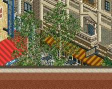
I also love the tiny bit of building we can see in the bottom left corner.
My only concern would still be about the beige path, looks clearly too clean but I guess that you will add details/life stuff later.
Well, this said, I want to finish telling you this is probably the best stuff/archy I've evern seen on RCT2.
gotdang
this is ok
Casa Bonanza