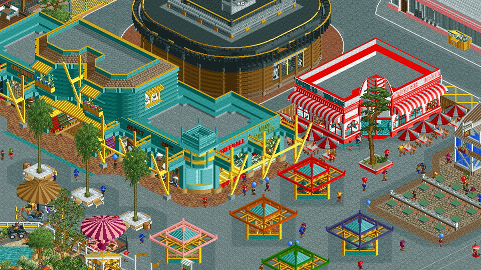
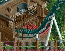
Love the use of color here. The red and white ‘diner’ style building is amazing and I may just have to steal a little inspiration for my new project. I’d like to see a little more greenery and foliage, perhaps a large tree peeking out from behind the large teal building.
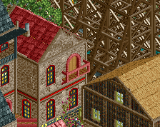
I'd like the colours better if the brown building in the background wasn't there. I can't lie, I don't like that one at all, even on its own. Also not sure the grey paths are a good choice, and the area may benefit from a more clear distinction between backstage and frontstage. The coloursful stuff however is very cool! Reminds me of high-tech architecture a bit.
Definitely agree with Liam on separating the backstage from the main midway a little more visually, different path colors should do that. And the brown building, just not my favorite.
Some really fun archy overall tho, really liking this project so far, seems like you're having a good time with it!
I'd agree that the brown building is a bit much. I feel bad recommending it be nuked/removed.. but it seems a tad big. Perhaps it could be a little more understated.
 28-December 22
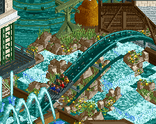
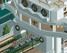
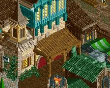
Big fan of this!
I'd like the colours better if the brown building in the background wasn't there. I can't lie, I don't like that one at all, even on its own. Also not sure the grey paths are a good choice, and the area may benefit from a more clear distinction between backstage and frontstage. The coloursful stuff however is very cool! Reminds me of high-tech architecture a bit.
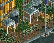
would you be able to make the rooves black in place of grey? it would help with readability. keep up the great work!
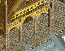
Lovely architecture.
Some really fun archy overall tho, really liking this project so far, seems like you're having a good time with it!
Yeah, kinda difficult to get the context of the backstage area. That brown building is a warehouse (or dumping ground) Maybe this angle is better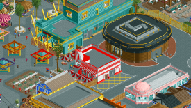
I'd agree that the brown building is a bit much. I feel bad recommending it be nuked/removed.. but it seems a tad big. Perhaps it could be a little more understated.