(Archive) Advertising District / MCI at work
-
 26-September 10
-
 MCI
Offline
Thank you!
MCI
Offline
Thank you!
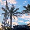
I changed a little bit and added new buildings.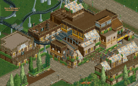
"New" Station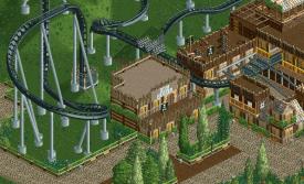
Restaurant "Zum Henker"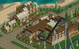
Backside of the station and new buildings (toilets in the middle and souveniers in the right building)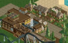
Other view
Gruß
MCI -
 Luigi
Offline
You are improving really quickly! I only think there are a tad too much of the hedges. Otherwise I really like it.
Luigi
Offline
You are improving really quickly! I only think there are a tad too much of the hedges. Otherwise I really like it. -
Dotrobot
Offline
You should exchange some of the trimmed bright green hedges for the dark hedge fences. I think they would look better in this case as well as adding some contrast.
-
MCI
Offline
Thanks guys!
I thought it would be time to show you a little overview of the area.
I started to theme the coaster and I added a "relax zone".
Gruß
MCI -
 Austin55
Offline
Everything looks great but that layout is scaring me just a bit.http://www.rcdb.com/r.htm?ot=2&ml=6803
Austin55
Offline
Everything looks great but that layout is scaring me just a bit.http://www.rcdb.com/r.htm?ot=2&ml=6803 -
 coasterfreak101
Offline
The area looks great. The coaster isn't overly realistic, and it certainly doesn't scream B&M, but so what? It looks fun, and hopefully runs well!
coasterfreak101
Offline
The area looks great. The coaster isn't overly realistic, and it certainly doesn't scream B&M, but so what? It looks fun, and hopefully runs well! -
 nin
Offline
NCSO with custom supports? Interesting. Ive considered doing something like that, nice way to mix up the norm.
nin
Offline
NCSO with custom supports? Interesting. Ive considered doing something like that, nice way to mix up the norm. -
Luigi
Offline
I agree with coasterfreak101 about the lay out. It really looks fun. The custom supports work well in this screen.
-
MCI
Offline
@suicidecarz: Thank you!
@austin55: Your right: the layout is not the typical B&M conservative "never try something new" Layout, but I´m not B&M. I thought about Airtime when I build this and I think I´ve got that pretty well...
@Coasterfreak101 & Luigi: Thanks guys! I wanted the Layout to be fun, not 100% realistic
@nin: thank you! I´m using them combined with NCSO since 2009. I´ve done some coasters with this combination on rct-world.com, but I never tried to make a whole park with them.
_____________________________________________________
Gruß
MCI -
 highroll3r
Offline
This looks nice MCI! I really like the foilage although you could do with putting grass or mud under it.
highroll3r
Offline
This looks nice MCI! I really like the foilage although you could do with putting grass or mud under it. -
Luigi
Offline
^Yeah, I agree. And perhaps you could try getting rid of the supports under the pirate ship. Don't know if it is possible with the woodstructures though.
-
 Liampie
Offline
All sand --> grass.
Liampie
Offline
All sand --> grass.
Pirate ship = totally out of place in every possible way
Barrells = random and irrelevant -
 Comet
Offline
Why is the pirate ship out of place?
Comet
Offline
Why is the pirate ship out of place?
I do agree you should add some grass in there somewhere though -
Liampie
Offline
- Because there it makes no sense to have such a big ship in such a small pond. They could've constructed the ship in the pond which makes no sense either.
- It's a lonely piece of theming in a large area, which makes it stick out in a bad way
- It's not very well visible, not even from the coaster.
- The left half of the screen is much denser than the right half
I just noticed something that appears to be a water spouting cannon. You couldn't have picked a worse spot for that. The view is blocked from virtually every angle!


Tags
- No Tags