(Archive) Advertising District / Faastopia
-
 08-December 12
-

Rhynos Offline
I'd point out the irony in your "not only the United States people" by way of both the BK and McD's placements, but really, this comment is about the logic behind them, in that, I believe only one of those companies would be able to sponsor or be in your park (just like having Coke or Pepsi sponsor your park).
And yes, Ruben, I used sarcasm (language barrier, maybe?).
Back to park shtuff. What I said above, Faas. -
 Ruben
Offline
Ruben
Offline
And yes, Ruben, I used sarcasm (language barrier, maybe?).
No language barrier, just a really crappy sarcasm radar. Happens all the time online, really need intonation & expression to get this kinda stuff, no matter what the language.
Faas, it's looking great, but very very ''pokey park'' again. (e.g. that mcDonals buildings looks tiny) Maybe give it all a tad more space to breathe? -
 Cocoa
Offline
if you're going for a sarcastic america, definitely switch the sign to 'merica, that's hilarious. or maybe, but some actual authentic american cuisine in, like a diner or something.
Cocoa
Offline
if you're going for a sarcastic america, definitely switch the sign to 'merica, that's hilarious. or maybe, but some actual authentic american cuisine in, like a diner or something. -
 Sulakke
Offline
It's weird having both the Burger King and MacDonalds in one park, especially next to each other. The Mac looks way too small to be operative and I recommend changing the blue sign to an other color, as blue is a very anoretic color.
Sulakke
Offline
It's weird having both the Burger King and MacDonalds in one park, especially next to each other. The Mac looks way too small to be operative and I recommend changing the blue sign to an other color, as blue is a very anoretic color. -
 Faas
Offline
@Cocoa and Sulakke;
Faas
Offline
@Cocoa and Sulakke;
I changed the McDonalds into a diner. I'm still not completely statisfied but I don't think I'll change it. Here is anouther random screen of Apache.
-
 pierrot
Offline
love it but four screens with in a week? I'm just bit worried about it..you know what I'm saying.
pierrot
Offline
love it but four screens with in a week? I'm just bit worried about it..you know what I'm saying. -
Louis!
Offline
He's worried about either you showing too much of the park or rushing the park to finish it.
-
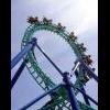
Ruben
Offline
This part of the layout looks quite interesting, nice flow and interaction. Hope the entire coaster will be of this quality. Foliage might need work thow, especially the grass/shrubbery, as it's very (very) simple atm. Some more variation, less random placement etc. might work in highlighting and framing parts of the screen/coaster.
I'm looking forward to seeing more of this, and knowing your style I don't share Pierrot's fears. I trust your style can easily be combined with this building rate.
-
Faas
Offline
Part of the park was already finished when I started advertising it. So I'm not showing too much since there is much more. Thanks for the replies everyone. I'll try to incorporate your tips and tricks.
As you can see, it is much easier to walk between the United States and Mexico in Fun Valley.
-
 Dimi
Offline
I love the sombreros! But the building will look better if you don't make the windows exactly the same colour as the walls.
Dimi
Offline
I love the sombreros! But the building will look better if you don't make the windows exactly the same colour as the walls. -

Felipe// Offline
Last screen looks so vibrant and warm. But I'm not sure if the mud texture is the best for it, maybe it just needs more details to break the aspect of a huge, plain wall. The burguer king sign would look better with dark blue.
All the way, good job! Seems like a real, solid step forward from Fun island, but keeping such cool style you build your things...


Tags
- No Tags