Screenshot / Old Buildings
-
 21-February 17
-
Six Flags Magic Mountain 2022
-
5 of 9
- Views 1,694
- Fans 0
- Comments 8
-
Description
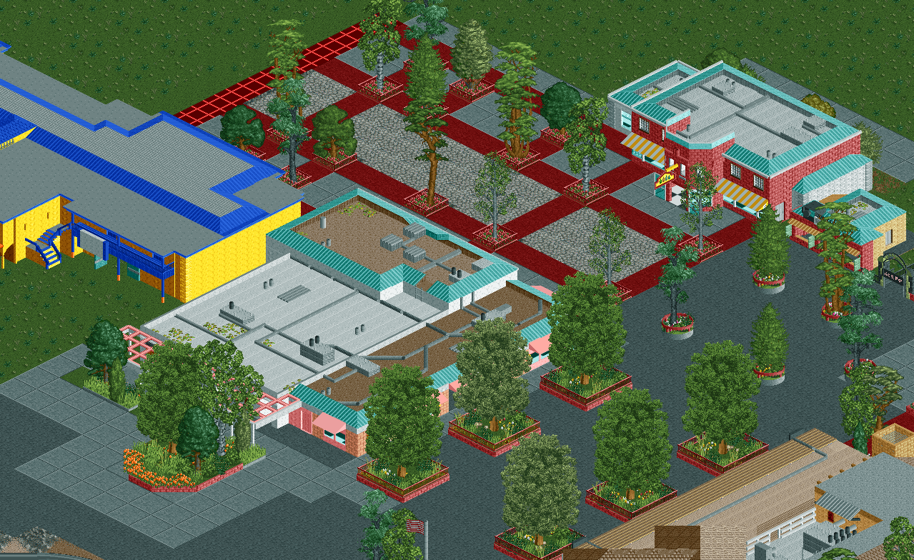
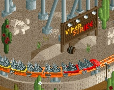
More of the entrance buildings from Six Flags Magic Mountain. Other than the yellow building, they are all done, but I still need to put flooring in all the buildings. There are also no other buildings in this area unless you count the actual gate which will be where the red grid is. Yes the yellow building is super ugly. There really isn't much going on on the walls or the flat roof unfortunately.
-
Full-Size
-
No fans of this screenshot
-
Tags
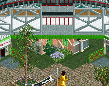
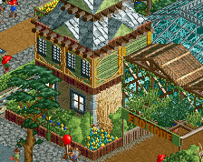
Here is another view, mostly to get an idea of how ugly the big yellow building is.
Your buildings are less the problem than your actual colors are. I'm telling you, use softer colors (aqua, tan, peach) and you're going to have a stronger atmosphere. There comes a point where you need to sacrifice realism for aesthetic, and you've been there for a while. Make it happen!
Steve is 100% right. The yellow building could use a few more details but aside from that the buildings are fine aside from the color choices.
I agree. I also think that it would be easier to examine more complete screenshots.
It's seriously funny how close this is to being an 80% screen, like another 30 minutes of bleeding out and sacrificing your .sv6 file and you've have a seriously dangerous product.
The composition (hard part) is actually really fucking good. All you need to do is listen to Steve and for the love of god do something other with the paths/planters than what's there. Copy raptor if you have to. Actually please do that.
I thought the colors here were a lot softer than the other screens. Is it just the yellow building, because I feel like the red, pink, and grey building all are pretty easy on the eyes.
The pink accents are harsher than the yellow building in my opinion.
#ListenToSteve