Park / [NEDC6] Gaudi Gardens
-
 08-May 25
- Views 1,359
- Downloads 211
- Fans 6
- Comments 30
![Park_6136 [NEDC6] Gaudi Gardens](https://www.nedesigns.com/uploads/parks/6136/aerialm6370.png)
-
![Park_6136_[NEDC6] Gaudi Gardens](https://www.nedesigns.com/uploads/parks/6136/logot.png)
-
 82.00%(required: 65%) Design
chorkiel 90% posix 90% J K 85% RobDedede 85% RWE 85% CoasterCreator9 80% deanosrs 80% pants 80% SSSammy 80% Terry Inferno 80% Recurious 75% Turtle 75% 82.00% -
Description
"There are no straight lines or sharp corners in nature. Therefore, buildings must have no straight lines or sharp corners."
-
6 fans Fans of this park
-
Full-Size Map
-
Download Park
211
-
Objects
3
-
Tags
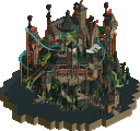
monsterbux takes third place with a stunning tribute to the architectural genius of Antoni Gaudí, bringing Barcelona's iconic style to RCT2.
earns NE Parkmaker
Ever since its first iteration, the New Element Design Challenge has been a proving ground for fresh talent to emerge; the limited map constraints and pre-set layout enabling those with a flowering style to show off their skills on a more ambitious yet manageable stage. Tonight we reach the pre-finale of this edition with the reveal of the 3rd Place podium spot, and as you can already infer, we have another 80+ Design winner on our hands—and rather amazingly another new Parkmaker to award.
In the first edition of this contest AvanineCommuter took third place position, exploding onto the scene with his magnetic Vesper
Island in the
run-up to a defining H2H run. The third podium spot tonight is quite reminiscent then: a player beginning to
stretch their stylistic wings who puts pen to page (mouse to screen?) and instantly claims a top 3 spot out of
seemingly nowhere: so it is that monsterbux places 3rd in NEDC6 with a brilliant
82.00% score
and with which she becomes our newest NE Parkmaker, just days after Jaguar!
Vesper
Island in the
run-up to a defining H2H run. The third podium spot tonight is quite reminiscent then: a player beginning to
stretch their stylistic wings who puts pen to page (mouse to screen?) and instantly claims a top 3 spot out of
seemingly nowhere: so it is that monsterbux places 3rd in NEDC6 with a brilliant
82.00% score
and with which she becomes our newest NE Parkmaker, just days after Jaguar!
I say seemingly nowhere, but that isn't quite true. Monsterbux is certainly new to NE, having only signed up to the site in November 2023, but she found her earlier roots on DKMP, and through contest collaborations that made their way to NE ( Taste of
Tuscany and
Taste of
Tuscany and  2 8 1 4 to
note) she was spotted by some eagle eyes - WhosLeon recruited her
to the H2HX-winning JazzCats, before which she was a novice with custom scenery. It proved to
be a flourishing environment for her - at first providing a modest share on Round 1's
2 8 1 4 to
note) she was spotted by some eagle eyes - WhosLeon recruited her
to the H2HX-winning JazzCats, before which she was a novice with custom scenery. It proved to
be a flourishing environment for her - at first providing a modest share on Round 1's  Royal
Institute of Extraordinary Biota but later
being given a more defining role on the Semi-Final winning
Royal
Institute of Extraordinary Biota but later
being given a more defining role on the Semi-Final winning  Meccha,
scoring among the top H2H parks of all
time. The expert acclimation to CSO building is readily apparent in her behind-the-scenes posts on that matchup,
creating all manner of complex robotic sculptures and shanty structures.
Meccha,
scoring among the top H2H parks of all
time. The expert acclimation to CSO building is readily apparent in her behind-the-scenes posts on that matchup,
creating all manner of complex robotic sculptures and shanty structures.
Monsterbux being from Denmark, now joins the small but mighty arm of Scandinavian NE Parkmakers, including Swedes Lagom and former Parkmaker Janus. To achieve this position and an affinity for the niche style of sandbox play we enjoy in such a short time frame is remarkable, perhaps the quickest ever to do so and earn a Parkmaker spot. Her NEDC entry is an announcement of her style and growth as a builder, a sublime map of eclectic colour patterns and organic architecture that pays loving homage to the visionary Antoni Gaudí. Congratulations Monsterbux, this moment is very well deserved and we can't wait to see what more you create!
Wow... this is like the sequel to Park Guell, but in HD. The landscaping is very nice, and the architecture is amazing. This is one of my favorite art/architecture styles, with its organic forms and shapes, and this park does not disappoint. I'm a fan of the unconventional scenery use... those argonath towers are perfect for art nouveau and I love the spiral-shaped trees being used as columns. The fisch rocks being used as rooftiles is also a great idea.
I think the strongest part of this park is that building in front of the hedge maze, the colors, facade, and windows are just so beautiful. I also really love the gazebos in that maze. The coaster also has a lot of nice interactions with the paths and that swan ride.
The landscaping is obviously the highlight of this and I do love how it appears layered. It is also very impressive how this basically completely breaks away from the grid. Everything is smooth and curved and there are very few sharp lines With its pastel color scheme, this almost evokes a dreamlike quality and it is relaxing to view this. The foliage selection is also brilliant for a Mediterranean/southern European setting.
My only critiques would be that there are parts where the curved walls and paths are glitchy, especially by the swan ride. And that the edge of the map feels rather jagged and rushed. It probably would have been better to stay with the curved walls over the half-diagonal terrain blocks for that.
Outside of that, this park is a wonderful parade of colors and it is a joy to look at. Congrats on a well-earned parkmaker title!
this was a great little map, excited to see you get parkmaker and very much looking forward to seeing what you tackle next. i expected to be on the lower end of the spectrum for this one, which feels a little harsh, but my overall feelings are that this juuuuuust tipped over into the "messy" side of things.
it's a really tough theme to tackle in RCT, one i've considered myself and always shied away from due to the organic shapes being almost impossible to accurately do in the game. i commend you for tackling it, and also definitely getting the closest that i've ever seen to the real thing. there were a few spots on the map that i felt like could have done with a couple more days of polish too, but that's the nature of deadlines and stuff i'm sure.
my favorite parts were the hedges opposite the coaster station, the drop tower, and the carousel cover. really high level stuff there. exciting to see someone tackling a big theme and you're someone that i'm definitely following to see what's next. congrats on top 3!
I loved everything, the buildings, the colors, the stones/rocks, the mosaics, the roof, the use of Argonaut which was very good, but what really caught my attention was the carousel, I've never seen a carousel like it, I really liked it. The design of the park is beautiful, happy, pleasant and clean. 80%
Perpetuum Mobile is one of my favorite songs, and the theme centered around Gaudi is superb. In terms of atmosphere, theme, and overall vibe this entry (unsurprisingly) landed VERY well with me. What’s also so impressive about this entry is the difficulty of translating Gaudi’s architecture into RCT, and you’ve managed to do it. The combination of Fisch rock pieces with other elements is truly impressive, and frankly I consider this entry to be ground breaking in terms of architectural exploration within RCT. Too often I think there is a focus on gimmicks, object creation, and extreme micro detailing in terms of the “meta.” Instead, this entry leans in HARD to elements of the game like aesthetics, form, color, and balance, which I think can play just as big a role in pushing our community toward fresh, new, cool RCT as the extreme micro detailing stuff. I am sure my review reads as mere gushing praise, and it mostly is, mostly because I cannot hide my positive bias for this type of theme and design style. Congratulations!
Holy smokes, monsterbux! I think this entry is a large, multifaceted diamond in the rough. I am overjoyed to see you have entered and to see that you have taken on such a singular theme. The work of Gaudi has been interpreted before by the Ultrarealists in Park Guell, but you have given it your own spin in a way that shows you are neither slouch nor coward.
Opening the park the first thing I thought was “son of Biota”. I am glad to see the vibes of Biota brought into new contexts here. There is a level of confidence with your craft which lets you bring such a strong atmosphere through object use and form decisions. The music was an excellent choice and brought strong vibes to the experience. I went and hunted down what the song was called - in hindsight, i should have just shazamed it, but I instead took the long way around and listened to a live show by Penguin Cafe Orchestra to find out the track is called “Perpetuum Mobile” for those enraptured like me.
The building to the left when you open the park is wonderful in so many important ways, but I think it trips at one important fundamental - I think each layer is so significant and thick, especially that flower and curved canopy layer, it makes the scale feel funny - I think adding a unit at every floor or layer would have given it that room to make it perfect. It, for now, will just have to settle for being a masterwork of colour, texture, and composition. Overlooking that water feature and the hedge maze is simply divine. Bravo.
The other buildings on this map are simply stellar. I really commend your commitment to capturing these ideas, you really brought them to life with gorgeous colour uses and inspired object use. The swan boats, though perhaps a bit of an afterthought tucked in the corner, are a great choice, vibes-wise.
The dominant viewing angle of the coaster appears to be “inside L”, where we view the inside of the predrop turn above the cobra roll. A strange optical illusion of this entry is that the ride appears to be significantly longer or perhaps larger than the other submissions. I believe this may be because of the more zoomed view the entry opens upon, implying a more zoomed context for the park, but more significantly it may be because of the deadzone in the middle of the map beneath the cobra roll. In a display of individuality, the cobra roll uneclipsed by a crossing path. There are, however, many moments of interaction elsewhere. The corkscrews leap over hedge mazes and the diveloop is framed inside the footpath on the higher terrace.
The balance of the entry feels very off, and I think one of the main culprits is the aforementioned deadzone. The simple grass should feel like a welcome break from the maximalist nature of the rest of the park, but it instead feels like a huge missed opportunity. I think it is because the coaster isn’t satisfyingly integrated in the same way some of the other interpretations we see in other entries. I think, perhaps ironically, there was more fanfare for the negative space, it would have been more effective. I imagine more of a trench for the coaster to go into, rather than the wider bowl you chose. The grassy area is recessed, but not in a way which plays to the strengths of the moment.
I think this also speaks to why so many people were drawn to using path over the cobra roll. Along with being a bit of a broader cliche, the footpaths offer a level of layer separation between the tracks stacking and interacting in this area. Also, there are fewer moments where paths or ride track pass over the coaster. There is a confusing moment where a small platform sits inside the turnaround into the MCBR, a moment of very little significance, and the other is to stage the diveloop under the higher terrace. The rest of the ride sits completely above its surroundings, damaging its ability to effectively integrate.
Though I appreciate the huge beautiful staircase on the right and the beautiful angle of the spiral staircase and waterfall on the left, the upper level was wanting from a macro perspective. I really want to speak about this monorail motif you have used, but I fear I may be unable without cursing. I deleted it, and the balance of the map skyrockets. The monorail in this context, where you have such an impressive level of grain across the whole map, and we even begin the journey zoomed in beyond normal zoom, is far too weighty. I’m honestly staggered at how great the map looks with that one simple change - and not even changing the track type, DELETING it. I feel as if the monorail is a vestigial artefact of your NCSO roots. I wish some of the bravery you had exemplified elsewhere in the park had allowed you to let it go.
Having a vast paved area led to by an ostentatious staircase from a relatively modest group of paths below really throws off the balance of the map in a harmful way. In this upper layer, the excellent buildings feel pretty plopped in without the same level of macro consideration as the other examples in the lower map.
One last roast as I am certain it will go to good use - you need to plaza the entrance to your coasters and rides. The coaster queue begins at a bottleneck which would have been clumsy even without the queue beginning there. You want the exact opposite, a place for peeps to stop walking and congregate without getting in the way.
Your mosaics and other path ornamentation is simply wonderful. The integration of foliage and landscaping is so very effective. With some simple design decisions early in the process, this could have easily been a contender for first place. As it stands, it remains a testament to how much you are improving release after release. I hope to see a red name for you soon.
SCORE: 80%, in great anticipation
Watch my initial reactions here!
This is an excellent map overall! I love your use of color consistently throughout the map. Your range of color palette taste really shows in this map since everything is so varied and yet all feels like it belongs together. The architecture is fantastic as well - I specifically enjoy the cafe the most but the station is a close second. The foliage around the map is varied and different, but it constantly compliments the complex building work you have, never take away from it. This is something to be proud of. The way you used trackitecture mixed with objects I usually don't see like the corner fisch rocks for one of the roofs is brilliant. The mosaic is a smart way to add color to a scene when you otherwise can't layer in foliage. Congrats on PM!!!
Damn this is pretty wild. As soon as you open the park the atmosphere hits you pretty hard! I really enjoyed your choice of pallette here. The colours throughout this entire entry were pretty top notch. I also really love the visual theme you have going on with all of the curves and round edges. It really looks fantastic from a macro perspective. I was also extremely impressed by how many fun moments there were in this park. The ground path detailing was pretty top notch! I also thought that your path colours and path types worked really really well throughout this thing. While I do think there are some things that could have been cleaned up a bit, this is an extremely impressive entry and a well-deserved score.
Foliage and Landscaping: I thought the foliage was pretty solid throughout this entire entry although you used some bush objects that I usually stay away from. The tree selection was great and I love that you allowed yourself to leave a lot of blank space to let everything breath. Furthermore, I was really impressed by how you made the blank grass spaces interesting with texture and little pops of colour. This scene with the cobra roll was absolutely stunning even though it was pretty much a dead space
I also really liked the use of the curved hedge obejcts even though they were a little messy at times. It was also kind of weird that the hedges were different colours in different parts of the map. Lastly, those palm tree planters looks wild, very cool.
I was a really big fan of the water and rock landscaping. You made great use of those boulder objects and I enjoyed the gradient that you chose. This little area with the waterfalls was fantastic
I was less of a fan of the curved wall pieces used as landscaping. I understand what you were going for but I don't think it translated well to the game and it looked pretty messy. I wish you would have just stuck with the Fisch rocks throughout the entire map.
Architecture: Kind of a mixed bag for me in this entry. What I did really like was the freshness of everything. The buildings felt so unique and had so much character. My favorite bits were the coaster station, the merry-go-round cover, and this little building here
All of these were so interesting and new. You utilized so many different objects that I would never even think to try to use and ended up with a lot of great results. I also like the mix of tracitecture in everything, it was a really nice change up and used well. Some buildings I think were a bit too abstract and messy for me. The two buildings on the raised section were both pretty hard to read and could have been refined a lot more. Same goes for the brown building by the corkscrew.
The Coaster and Other Rides: The coaster really feels like it fits in with everything in this submission. I love the path interaction that you achieved here. The colour choices were also pretty perfect for the theme. I also love the other two flat rides that you have here. The swan ride was also a nice touch and maybe one of my favourite areas in this entry. Although the back stage area of the swan ride felt weird a bit out of place on the map.
Overall: I really enjoyed this entry. I think it was rated by the panel appropriately, and I'm very excited to see what you do next. I would love to build a project with you sometime! I rated this 80%
These were my initial thoughts when rating it:
This is fantastic! As of this writing I don't know the score and I'm not sure whether this will make you parkmaker or even elite. I'd say both are deserved. At first view I thought it was a bit messy, but when diving some deeper in the map that's just busy by design. The architecture was another clear standout for me: Belle Isle meets Park Guell? Congrats on this!Some additional thoughts:
Outright loved this release and it was one of my favorites of the contest. It truly felt like a design in the classic sense: the coaster was a centerpiece, but everything around it elevated its impact while also standing out on its own. Every building had its own distinct character as did each ride. The mosaic pathways and colored railings tied everything together but also gave each area its own identity.
I debated with myself on whether 90 would be too high of a score. Then I looked at the top rated designs page. In my opinion, this is easily up there with designs like El Encierro and Vulture. Congratulations on making parkmaker! Not elite yet, but I wouldn't be surprised to see you make that soon.
It’s just so pretty!
++ The dragon spine maze was exceptional, you can put a dragon spine on anything now and I’ll be high-voting
++ Negative space on the main section of the coaster was ballsy but so different to the other entries, I’m here for it.
++ That cafe near the front of the park was one of the best structures I’ve seen in the competition, that was great.
++ This felt like a H2H park which is amazing on the face of it considering the timescale you had vs building it on your own.
+ Architecture rivalling FK
+ Waterfalls rivalling Steve
+ Curves and swerves rivalling Andrew
+ Supporting rides were really well judged
- A few tiny bumps and misses on the support work but great work overall
85%
-Concept: ***
Reminds me of a mix between Park Guell, Biota & Belle Isle, but still you've added your own unique touches. Also everything being in the concept of the curves is well thought out and executed to perfection.
-Content: ***
A lot to explore; from the architecture, the supporting rides to all the path mosaic.
-Quality: ***
Consistent quality throughout, the ''fried chicken stall 1'' building is of exceptional quality though, really love that one!
Overall;
Such an unique park, didn't expect this coming from you Monsterbux! This is what Biota should've been, then it would've won easily
I hoped someone would use the 1/4 (half diagonal/trims) paths I made for the 2023 bench in unique creative ways like you displayed here, and I'm just very excited to see how you've executed these path patterns! Really gives it an unique touch and makes the whole piece of such high artistic quality. Also fits in well with the Gaudi Gardens concept.
When I read you also wanted the architecture to look organic, I was thinking how would you realise that.. But you managed to create very organic and interesting architecture throughout, which again fits really well with the whole concept & theme.
Also want to commend you on the excellent color pallette and color usage throughout the park. Gives it a great artistic vibe.
The foliage and landscaping also feels very natural and organic. Minor point of criticism are the Fisch rocks at the back, as I feel they look kinda bare and a bit glitchy under the curved brick walls. I think raising them up in the draw order using the Tile Inspector could fix that. Not a biggy though..
Finally want to mention the supporting rides, as they also fit in so nicely around the coaster and in the whole of the park. Especially like the maze wall build out of coaster cars and the bit where the swan boat ride goes through El Sueno de Gaudi's station building.
If this is #3, I can't imagine what the top 2 will be!
Great job Monsterbux!
Talk about sensory overload - I think that’s clearly part of the intent. Impressively elaborate, but perhaps a bit incongruous with its own ideas. In spite of it all, the coaster still stands out as the focal point. A very unique combination of fantastical designs with realistic park structure. 80%
Wow what a map! Love all the curves and the architecture freaking rocks! Some of my favorite buildings of recent memory for sure. Especially love the blend of CSO and some trasteful trackitecture for these nice flowing, fluid buildings.
Colors are also excellent, of course im a fan of the tan, but this combined with the nice deeper colors and the pastel tones looks awesome. Creates a really nice atmosphere. Certainly a lot to take in sometimes with all the shapes and floor decorations, but i really like it.
Some minor critique would be some glitching with the pathing, a miss on the support and a few of the benches being a bit weirdly placed from some of the angles. Doesnt take much at all away from this gorgeous map though!
Overall a superb map that deserves to make parkmaker status, congrats again on that awesome achievement! Cant wait to see where you go from here, looking forward to your next release! Great work!
This is a fantastic interpretation of Gaudi's style in RCT, the architecture is spot on and the pathing is great, some great mosaics, great pops of bright color and a lot of grid-breaking, backed by some great foliage and landscaping.
Gaudi Gardens is a brilliant and uniquely themed map that beautifully translates Antoni Gaudí’s architectural genius into an RCT park. Having visited Barcelona a few years ago, it’s incredible to see his iconic style mixed with your own creative building techniques. The vibrant use of color, flowing curves, and impressive trackitecture make this submission truly stand out. Overall, it’s one of my favorite entries from the contest. Congratulations on reaching Parkmaker status—it’s well deserved!
monsterbux, wow, surprise of the contest for me. This was amazing, truly. Archy was unique and different, and done so cleanly and with clear vision. I appreciated the different levels you created and how well it framed the map and coaster, made it easy to view and actually enjoy the details. Just a really fresh feeling style and approach to the game too that mixed a lot of great elements from others but also felt entirely different. Fantastic use of negative space too, that is a great touch that paid off well. Very excited to see what you do next.
85%
I really enjoyed looking through this park. I enjoyed the rides, the scenery, and the use of negative space. I'm old enough to remember other takes on Gaudi's architecture in RCT but this is the best one I've seen. I'm going to give this a 90. Very nice work and I can't wait to see what's next.