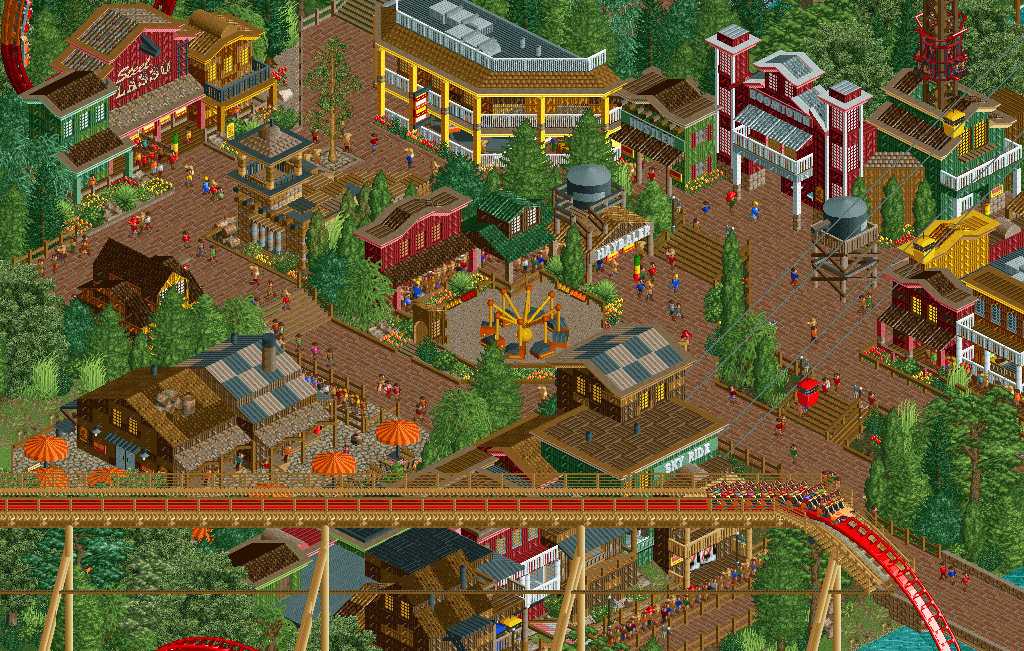
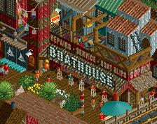
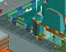
I wish your buildings were deeper, if that makes sense. They all feel like just facades with nothing behind them, makes them feel a bit cheep.
The yellow building with the diagonals is the biggest offender of this, doesn't really make sense to have a 45* wall like that, not very space efficient.
Very inviting atmosphere here. Agree with G Force, you have space to extend a deeper flat style roof behind what looks to be a facade or false front of these buildings..... THIS LOOKS REALLY GOOD THOUGH.
Your foliage always seems so thick compared to everything else. I don't think this is helped by how thin your architecture is either, everything falls into a perspective to make it look like there's just always too much foliage.
Don't be afraid to leave areas open a little more, let them breathe so that it doesn't feel so claustrophobic.
Also, you always use the same kind of fence which must use so many objects. Maybe think about making that into an object if you haven't already? Or just use a wall tile fence instead!
Thanks for the feedback guys! The facade thing actually looks like more of an issue in this screen than it actually is anywhere else but I'll see what I can do. I'll definitely extend that yellow building.
Looks great. It's so typical of your style with all the green and yellow combos. You do have your own colour pallet, and I like it.
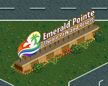
BTW, the lawyers of Jappy Amusements Inc. would like to have a talk with you about the name....
I like this well enough, but I do agree with G_Force on the buildings being too skinny. They look really rather odd to me because they are so neatly decorated, yet fails to convey the 'proper' width for a building of that designated size. I do not know how much you could fix that, but doing so would easily make this a better park in my opinion.
Otherwise, it is quite spectacular, and you should definitely keep it up!
 17-September 17

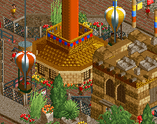
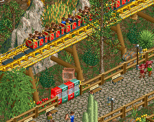
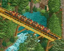
this is a lovely little area
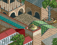
your archy is improving, but stop using that checkerboard roof bullshit. really nicely composed tho
Never
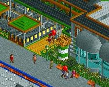
Individual components look really well done, but it's really busy and hard to read. The yellow building at the top could be a unit deeper too.
Looks great. It's so typical of your style with all the green and yellow combos. You do have your own colour pallet, and I like it.
BTW, the lawyers of Jappy Amusements Inc. would like to have a talk with you about the name....
https://www.nedesign.../coyote-canyon/
I wish your buildings were deeper, if that makes sense. They all feel like just facades with nothing behind them, makes them feel a bit cheep.
The yellow building with the diagonals is the biggest offender of this, doesn't really make sense to have a 45* wall like that, not very space efficient.
Very inviting atmosphere here. Agree with G Force, you have space to extend a deeper flat style roof behind what looks to be a facade or false front of these buildings..... THIS LOOKS REALLY GOOD THOUGH.
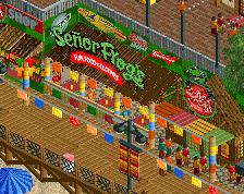
I find this screen quite humorous in that everything's cute and sweet, ........and then there's the monster looming in the bottom part.
Quite nice work. I find it overtextured and in colour disbalance. The style seems lose and underdeveloped. Still full of potential though.
Your foliage always seems so thick compared to everything else. I don't think this is helped by how thin your architecture is either, everything falls into a perspective to make it look like there's just always too much foliage.
Don't be afraid to leave areas open a little more, let them breathe so that it doesn't feel so claustrophobic.
Also, you always use the same kind of fence which must use so many objects. Maybe think about making that into an object if you haven't already? Or just use a wall tile fence instead!
Thanks for the feedback guys! The facade thing actually looks like more of an issue in this screen than it actually is anywhere else but I'll see what I can do. I'll definitely extend that yellow building.
Thanks, and LOL holy sh*t the flume has the same name too.
I like this well enough, but I do agree with G_Force on the buildings being too skinny. They look really rather odd to me because they are so neatly decorated, yet fails to convey the 'proper' width for a building of that designated size. I do not know how much you could fix that, but doing so would easily make this a better park in my opinion.
Otherwise, it is quite spectacular, and you should definitely keep it up!
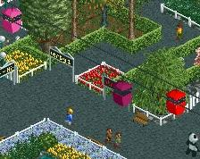
Nice build! Very cute. I'm really excited about this! Keep it up!.
It's nice that you aren't shy about color.