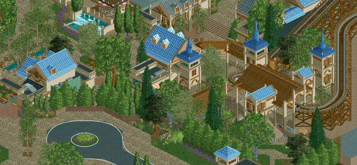
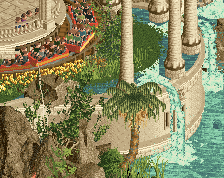
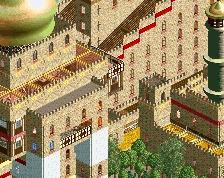
Screenshot / Riverview Theme Park Entrance
-
 08-December 18
-
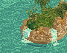
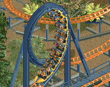
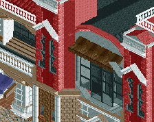
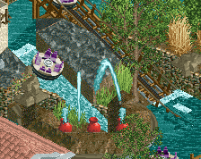
Riverview Amusement Park
-
1 of 3
- Views 4,124
- Fans 10
- Comments 32
Community Forum Software by IP.Board
RMM Offline
whoa. ridiculously pretty.
the colors are perfect.
Turned out really well with everything filled in, nice work.
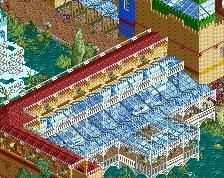
I wish these shades of blue were available all the time. The palette does make the (brown?) brick in the bottom right look distractingly strange. Really lovely mix of textures here though.
#alleghenyadventurespart2
#not94%though
I really like what you did with the station's roof. Lovely textures!
Jeez Steve this is really good. Lovely colors and textures.
Nice colors, what a beautiful park
Incredible stuff, man.
Phenomenal.
This is so Steve it hurts.
Great stuff!
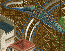
Really great. I hope it gets some more path-level details to add some hits of bright color, in the future. And maybe that gray-roof building wants a black roof, not sure.
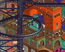
At some point, I might have to steal the RS wood roof + Spanish eave look you have going.
No intention to be negative, but I find the colours somewhat boring, and like with Ghoul, I'm not a fan of the tree choices you make as of post-2015. RCTC's influence?
Otherwise there's a lot to like of course.
The only issue I can find with this image is that the brown stone color used at the bottom of the station and in other areas is nearly identical to that of the sand terrain you're using next to it, so the walls end up blending in a bit too well with the ground. Since the color does work very well with the rest of the architecture, I would consider using any other terrain paint around the bases of these buildings to make those edges really pop.
if that bottom left portion of the screen looked as polished as the rest this would for sure be 90% from me.
It just feels so tranquil and inviting. I'm jealous I didn't build it.