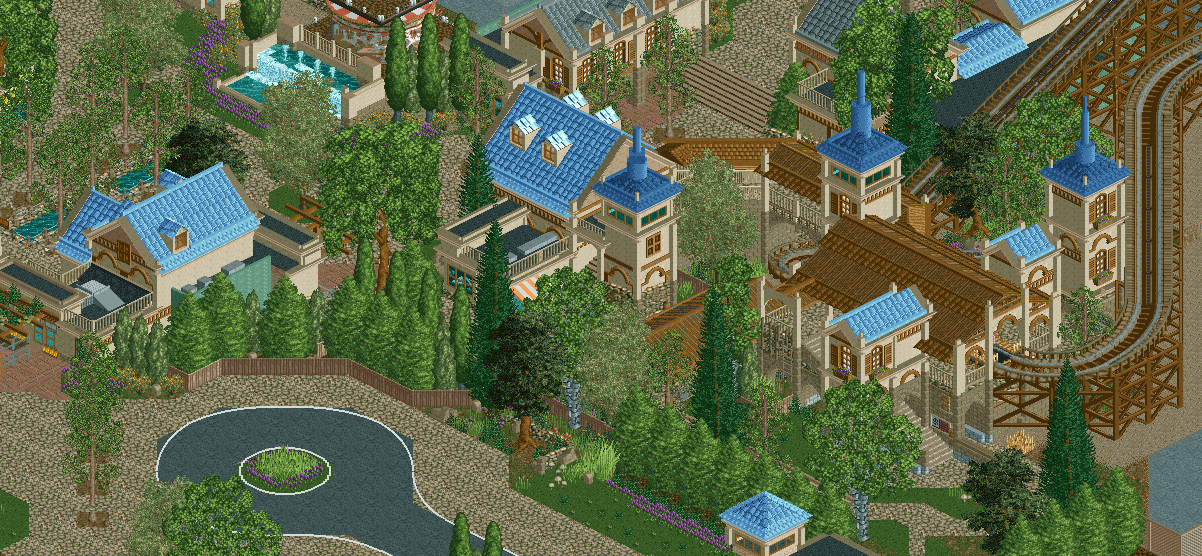
Screenshot / Riverview Theme Park Entrance
-
 08-December 18
-
Riverview Amusement Park
-
1 of 3
- Views 4,121
- Fans 10
- Comments 32
Community Forum Software by IP.Board
posix, what don’t you like? The textures of trees I use lately are still all in-game textures. If anything the trees are just larger. Is there too many of them or is the selection itself you dislike?
Love it!
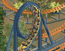
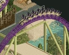
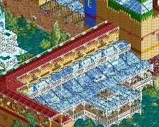
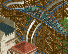
I think I really just want to see the layout of that coaster.
I believe it's the grouping of them I dislike. Is it your goal to make it look "made" because it's a park and thus every tree is the same? If so I think there are more interesting ways to design that than simply placing them again and again. I would still much prefer it if you wanted to design actual foliage like you used to. You're amazing at that.
The trees now are also mostly spiky and thus compete with one another a lot. They are meant to be prominent and separate the screen, but they just don't look nice. They also have very different green tones that clash, especially the dark green ones that are intended to play more important roles. Then there's the one very big one, which personally I don't think is a very tastefully made object to start with, and that mostly just blocks the view of everything behind it. I feel that's a shame because I want to see the beautiful Steve park design.
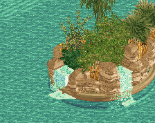
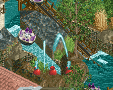
- I would suggest to replace the top left "thin" and tall trees with shrubwork or gardens, perhaps in the same style and purple the carousel has it, as a kind of visual attractor towards it.
- I would remove two of the three very spiky trees at the bottom of the carousel. Do you really think they look nice this way??
- I would change the trees so that the exit (entrance?) of the coaster is actually visible from this angle. It looks beautifully made, it's just totally concealed. It's nice to experience these areas of the park that you only access if you've left the main path. They should be their own little world you can explore.
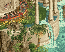
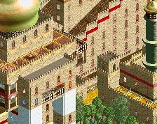
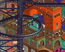
Almost has a medieval feel. Perhaps the palette is a bit too washed out.
How are you so good?
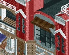
Brown is not a theme
wow
So warm. Good work brother.
One of the best things I have seen in a long time.
yeeeeeeeeeessssssss so good