Screenshot / Blackjack Station -- Coors East
-
 03-February 19
-
the big dirty
-
9 of 10
- Views 4,776
- Fans 3
- Comments 47
Community Forum Software by IP.Board


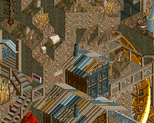
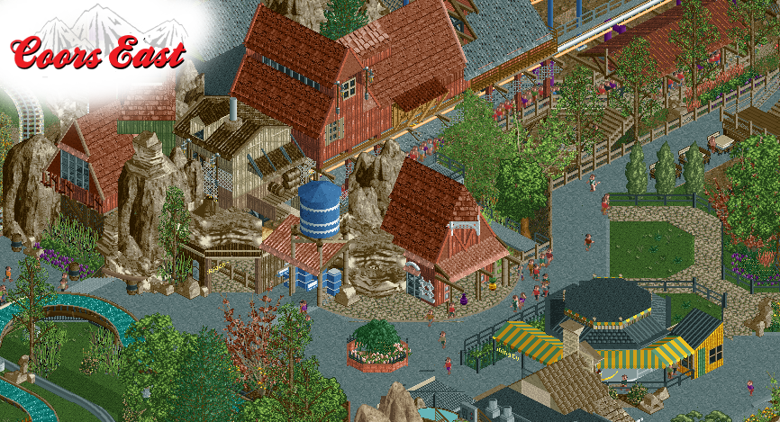
The palette really takes away from my enjoyment here - all that pink is off-putting - but aside from that I'm either missing a layer of sarcasm or everyone is genuinely voting on the username and not the content. This is intricate and thoroughly believable busch-brand realism. It's pleasant and well-composed from both an RCT perspective and a park planning perspective. Nice memorable and thematically-appropriate station styling, fun queue entry focal point. Microdetailing of the station, queue, and track is recognizable but doesn't ruin the aesthetics. Clearly thought-out park ops considerations with some minimal and not unpleasant backstage and a well-integrated requisite gift shop. I fail to see how this is not very successful modern NE realism.
85%+ with the room for improvement being the colors (just not to my taste), the clarity of the texture pileup that is that rockwork, and whatever is going on with the yellow awning building. I can't tell what it is or how guests are supposed to approach it.
sorry because of my opinion
I will never understand how building an entirely custom, realistic amusement park is anything short of creative.
Telling shogo to build something else entirely is neither of those.
i voted 100% because no one can stop me and that's how i regain control over my life.
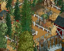
Also I like it, not perfect, but i like cozy tight-knit spaces like that
Probably the only true thing said in this thread.
Once again, ][22 has said everything that needs to be said, so for my opinion, just read what he wrote again.
Seeing as you mentioned me, I thought I'd leave you a comment. I for one like the screen a lot.
Someone please tell me how this is the case. I honestly couldn't point to anything in this screen that I genuinely like. I find it unpleasant, clinical and heartless. A bunch of stuff placed to look complicated but with no regard for feelings or even aesthetics.
That's why I voted 65%
This is not your best screen. It feels disjointed because of the foliage and archy colours I think, but it is also because you suck at taking and cropping screens.
I would like this to be more simple.
I agree with the overreacting bit but there's definitely some weird bits that I cut out into the screens below. I cropped them a bit large, because leaving out context wouldn't be fair.
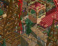
Screen 1: there's just a lot of shit going on in the center and I don't know what's what and I have a hard time making sense of what's where in space. The screen overall is much cleaner than your usual stuff, but this is an example of what not do do.
Screen 2: the ugly back facade is blocking the pavillion in a very ugly way that makes it unnecessarily busy. There's no visual buffer. Also: the rocks appear to be floating. Just the wrong place for them judging by this angle.
Lol is this really your thought process for voting? You don't like anything in the screen and still give it mid-silver? Usually when I don't like anything I give it less than a 25%....
We can't be afraid to give a well-established Elite Parkmaker our true opinions. That's how the accolade system gets degraded. No one gets better by giving them scores that don't reflect how you really feel.
I like it. 0%
I also like it. 85%
@nin - IMO it is creative in the same way that carpentry is creative, which means I see it more like a planned "craft" rather than an "art". For all the creativity that is required to create a beautiful realistic park, I personally feel in general there's another level that's inherently not possible in realism because it always has to reference existing reality - and it's therefore more limited in a way that non-realistic parks may not be.
I like the screen a lot. Only critique is that I'm not a fan of some of the wood having the exact same colours as the rock, hard to see what is what. great work zac
I rate this comment section reeeee/10
I know this screen's gotten too many comments already but here's my thing about realism in RCT. I can understand why people are usually more interested in things that they can envision being done in real life. There's lots of good details that you can put into your park by studying real life that a semi-realism or fantasy player would overlook. But in real life people also do new attractions that nobody's done before. If you're basing your park solely on things that other people have aready made you're missing out on a large part of what it means to be realistic. WIth all the good custom ride makers there's no reason why people can't make stuff up that could be done in real life but hasn't been done yet. For instance, one could take the idea of the Fourth Dimension Coaster and apply it to a Spinning Wild Mouse to make a coaster that spins sideways on demand. There's a big difference between that and say a magnetic levitation coaster that jumps its track. To sum it all up, there's a difference between realism and literalism and we'll all be better off if we learn the difference.