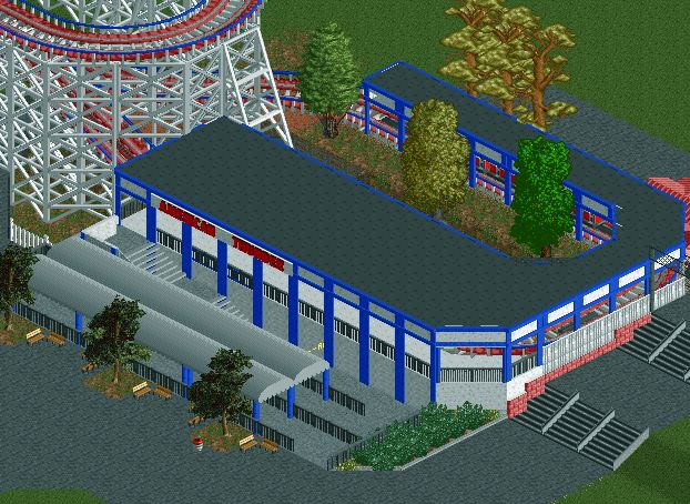
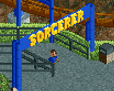
Very classic looking station design. Curious to see you if you add more to the path to add life to it. Maybe replace one of those Asian trees with a custom Dippen Dots stand?
As a foundation, I think this is solid and the composition is great. I believe I saw some screens of this in discord, and I think you've captured the shape and intent you were going for.
That being said, I think some of your choices make the screen feel a bit flat and heavy. The grey roof above grey path with grey stairs, the different wall types on the right that aren't on the left. Adding some thicker poles behind the blue supports would help give depth and definition to the structure. I think what you have is a good foundation, but the details are what will carry this to the next level.
I'd recommend looking at CP6's work in particular. He does a great job of capturing the simple but important details that bring these kinds of stations to life.
The form is there, but I feel like you could still implement more architectural details and materials in your work. It can come off unfinished and is easily fixable, and example being the queue fence you're using. A post/deco every other tile or so would solidify that fence and make it feel more grounded and real. Additional deco and details like rooftop stuff would solidify your station as well, and so on.
Just look at reference and really analyze what you're looking at, and do your best to translate that into RCT. You'll get there.
Thank you all for the feedback. After looking at the screen and taking y'alls suggestions into consideration, I have decided to scrap this station and start over. Please downvote this screen. Thanks.
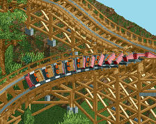
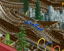
American Thunder is a classic wooden coaster best known for several airtime-producing bunny hills and its long reign inside Six Flags Adventure Kingdom.
 30-August 20

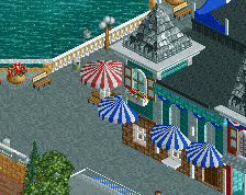
Very classic looking station design. Curious to see you if you add more to the path to add life to it. Maybe replace one of those Asian trees with a custom Dippen Dots stand?
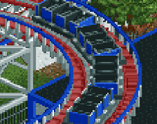
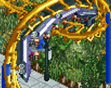
This screams Comet. Really like it!
As a foundation, I think this is solid and the composition is great. I believe I saw some screens of this in discord, and I think you've captured the shape and intent you were going for.
That being said, I think some of your choices make the screen feel a bit flat and heavy. The grey roof above grey path with grey stairs, the different wall types on the right that aren't on the left. Adding some thicker poles behind the blue supports would help give depth and definition to the structure. I think what you have is a good foundation, but the details are what will carry this to the next level.
I'd recommend looking at CP6's work in particular. He does a great job of capturing the simple but important details that bring these kinds of stations to life.
The form is there, but I feel like you could still implement more architectural details and materials in your work. It can come off unfinished and is easily fixable, and example being the queue fence you're using. A post/deco every other tile or so would solidify that fence and make it feel more grounded and real. Additional deco and details like rooftop stuff would solidify your station as well, and so on.
Just look at reference and really analyze what you're looking at, and do your best to translate that into RCT. You'll get there.