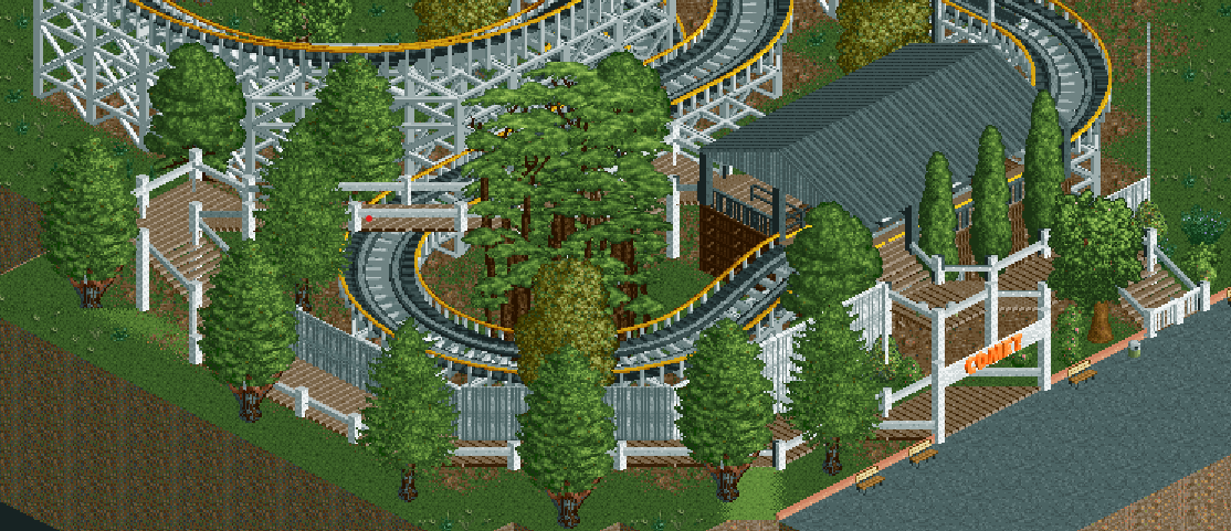
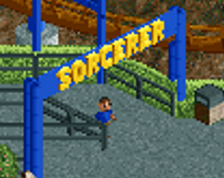
It's quite sweet. I like how the queue goes round that turn against the wooden wall. Otherwise the station's architecture is quite bland and uninteresting. Landscaping is more or less left out of this, ie no terraforming, sans some of the trees you dotted around, and the mild texturing going on. Think you can do much more here. Elevate the land a little.
It looks like you're scared to make mistakes in RCT and thus waste your time. If you're not feeling a more immediate access to the game as a creative outlet, it can help to mimic some of your favourite parks to establish some design routines. Also means you'll brick your path to originality to certain extent of course. Most of us have found a balance over the years, and with some confidence in your style also more room for experimentation at a later stage. Just need to find your route.
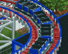
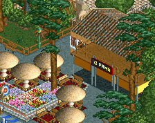
White and yellow is nice. What stands out to me negatively is the 'wrong' colours for the tree trunks. They're made to be tan - and the tall ones in the centre are best in grey, their original colour, in my opinion.
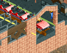
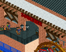
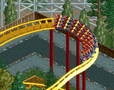
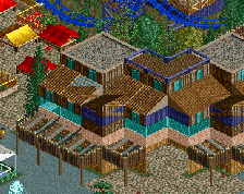
Nice colors. As I mentioned before, really analyze your reference material and understand construction technique to make your buildings, platforms, etc be believable. Right now they're either coming off as flimsy (walkways) or out of scale (station). Understanding what your trying to build will help you better convey it.
 23-February 21

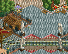
It's quite sweet. I like how the queue goes round that turn against the wooden wall. Otherwise the station's architecture is quite bland and uninteresting. Landscaping is more or less left out of this, ie no terraforming, sans some of the trees you dotted around, and the mild texturing going on. Think you can do much more here. Elevate the land a little.
It looks like you're scared to make mistakes in RCT and thus waste your time. If you're not feeling a more immediate access to the game as a creative outlet, it can help to mimic some of your favourite parks to establish some design routines. Also means you'll brick your path to originality to certain extent of course. Most of us have found a balance over the years, and with some confidence in your style also more room for experimentation at a later stage. Just need to find your route.
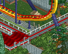
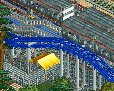
Big fan of the queue line, especially like the little walkway bridge over the coaster track, great job!
White and yellow is nice. What stands out to me negatively is the 'wrong' colours for the tree trunks. They're made to be tan - and the tall ones in the centre are best in grey, their original colour, in my opinion.
Nice colors. As I mentioned before, really analyze your reference material and understand construction technique to make your buildings, platforms, etc be believable. Right now they're either coming off as flimsy (walkways) or out of scale (station). Understanding what your trying to build will help you better convey it.